Website popup examples show what works, what doesn’t, and how to design popups that drive conversions. As a marketer knowing these is a must, since popups are one of the most effective lead generation tools.
If used right, popups can do more than capturing email addresses. A high converting popup provides value to users without disrupting their browsing experience.
Moreover, you can increase AOV, sales and reduce cart abandonments significantly using your website popups.
That’s why, in this blog post, we have shared.
- 15 high-converting website popup examples
- Tips to design your popups
- Free website popup templates
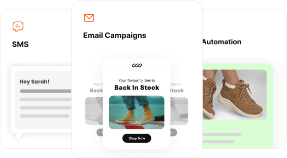
Create stunning popups within minutes using Retainful’s 100 + pre-designed website popup templates.
Key Takeaways:
- Diverse types of popups and their optimal use cases for e-commerce businesses.
- 15 best website popup examples for inspiration
- Free popup templates and tool recommendations to build popups
What are Website Popups?
Website popups are on-screen messages or windows that appear while browsing a website. They’re used to promote offers, get consent for collecting cookies, display announcements, or even encourage signups.
Related Reading: What is a Popup? – Examples + How to Create.
15 Best Website Popup Examples
Website Popups are essential, but deciding when to show one determines whether it’s a good or annoying popup. You can trigger popups by user actions such as scrolling, adding items to the cart, or attempting to exit the page.
To display generic sale discounts and personalized offers, you can use discount popups. Moreover, for announcements and important notifications, use time-delayed popups. Now, let’s take a look at the website popup examples.
Here is a list of 15 best website popup examples:
- Account Creation Popup
- Click-triggered Welcome Popup Example
- Welcome Discount Popup Example
- Time-delayed Welcome Popup Example
- Exit intent Website Popup Example
- Website Popup Example to Display New Arrivals
- Click-triggered Add to Cart Confirmation Popup
- Slide-in Add to Cart Confirmation Popup
- Cookie Consent Website Popup Example
- Privacy Consent Website Popup Example
- Full Page Website Popup Example
- Region Redirect Website Popup Example
- Geo-targeted Website Popup Example
- Countdown Website Popup Example
- Exit intent Website Popup Example to Collect Feedback
1. Account Creation Popup
This website popup example from GymShark uses popups to grow the contact list. It effectively encourages visitors to create accounts in exchange for exclusive deals.
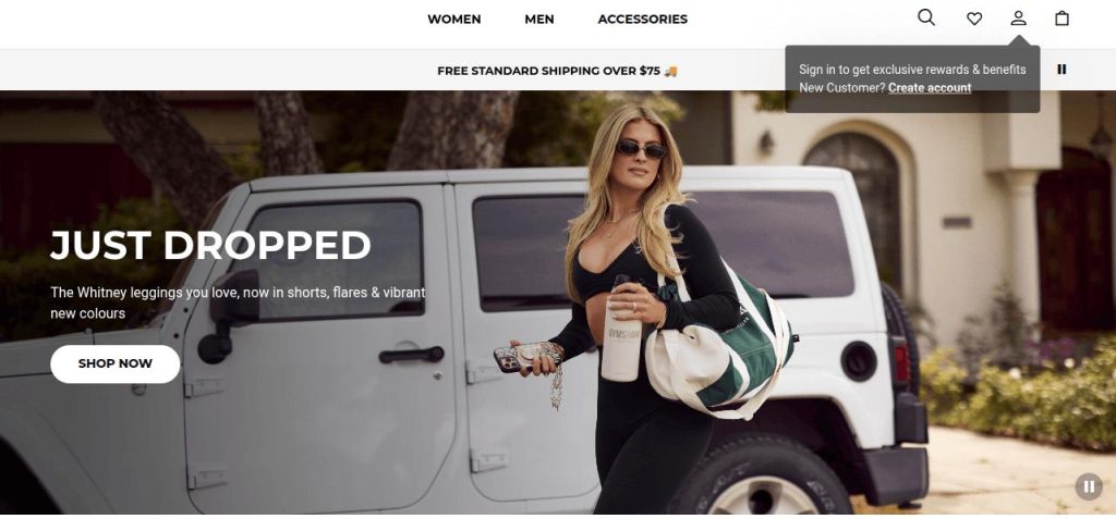
Takeaways from this website popup example:
- Popup placement: The popup appears in the top-right corner, avoiding the main visual area. This ensures it doesn’t block product imagery or interrupt browsing experience.
- Non-Intrusive Design: The popup uses a dark semi-transparent background with simple text, making it noticeable but not intrusive.
- Clear Value Proposition: The message “Sign in to get exclusive rewards & benefits” provides immediate value to the user.
- Targeted Messaging: The secondary line, “New Customer? Create account”, addresses new users, offering a clear CTA.
Related Reading: 8 Email Capture Best Practices to Grow Email List.
2. Click-triggered Welcome popup example
Fanciful Doll uses a smart teaser-triggered popup approach on their website. It offers a 10% discount through a single-field signup form.
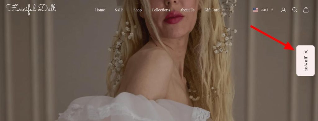
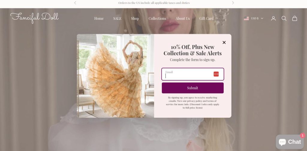
Takeaways from this website popup example:
- Placement & Visibility of the Teaser: The “10% off” teaser is vertically aligned on the side, making it easily noticeable without disrupting the browsing experience. Moreover, the teaser evokes curiosity and encourages users to interact.
- Triggered on Intent: Clicking the teaser triggers the signup form. It is a good example of intent-based interaction.
- Strong Value Proposition: Offers 10% off and exclusive sale alerts, which are direct and compelling.
- Simple UX: Only asks for an email address, reducing friction. One-step form with a clear, contrasting “Submit” CTA.
Create non-intrusive teaser popups with Retainful’s drag-and-drop popup builder and reduce bounce rate effortlessly.
3. Welcome Discount Popup Example
This website popup example from FashionNova is conversion-focused and collects leads effectively. It uses incentive-based messaging, personalization, emotional CTA copy, and a well-designed opt-out option.
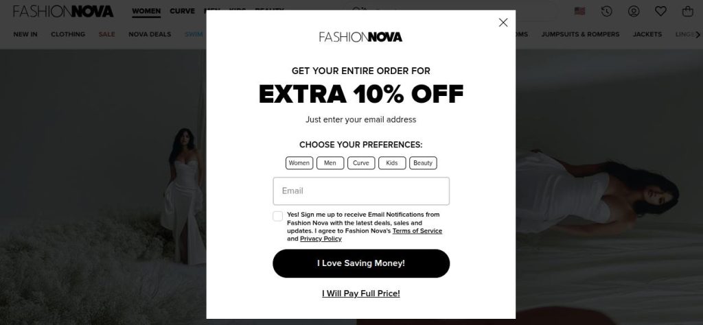
Takeaways from this website popup example:
- Segmentation via Preferences: Offers buttons to choose preferences, enabling audience segmentation for personalized future emails.
- Minimal Form Field: Only asks for the email address, keeping friction low and improving submission rates.
- Strong CTA: Uses a positive, emotionally compelling copy instead of a generic “Submit” or “Sign Up”.
- FOMO opt-out option: “I Will Pay Full Price!” nudges the user to reconsider leaving.
- Trust and Compliance: Includes a checkbox and clearly links to Terms of Service and Privacy Policy, which helps with trust and legal compliance.
- On-Brand Design: The popup design is consistent with Fashion Nova’s visual identity, making it feel like a natural part of the site.
Related Reading: Difference Between Email Segmentation and Personalization.
4. Time-delayed Welcome Popup Example
One of the most commonly used popups is time-delayed popups. The Capsul Jewels website’s popup displays after 5 seconds to encourage sign-ups and first purchases.
Here, they have used Free Shipping as a reward to encourage users to submit their email address.
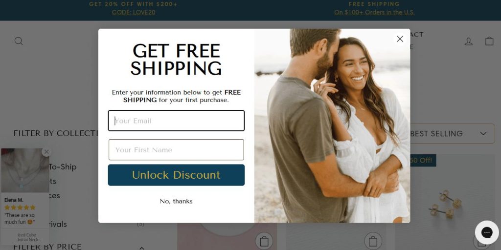
Takeaways from this website popup example:
- Clear Value Proposition: States the benefit clearly, free shipping on the first purchase.
- Lead Capture Form: The form requests only two fields: email and first name. This keeps it simple and increases the chance of submission.
- Strong CTA (Call to Action): The button text “Unlock Discount” creates a sense of exclusivity and urgency.
- Exit Option: The popup includes a visible “X” and a “No, thanks” link, giving users an easy way to opt out.
5. Exit Intent Website Popup Example
Exit intent popups are triggered when users are about to leave the website. The Allen Solly exit-intent popup captures users before they leave, offering a smooth login/signup experience.
This website popup example uses a mobile-first, OTP-based lead capture approach.
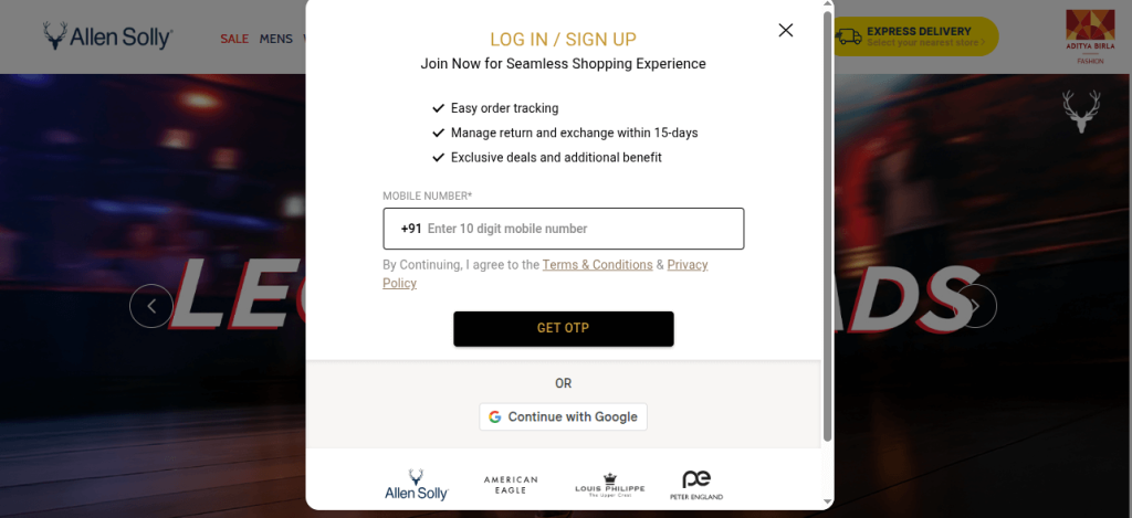
Takeaways from this website popup example:
- Clear Value Proposition: Communicates benefits of signing up, Easy order tracking, 15-day return and exchange, and Exclusive deals and additional perks
- Minimal Input Fields: Only asks for the mobile number, reducing user friction and increasing the chance of submission.
- Social Login Option: Includes a “Continue with Google” button, allowing one-tap login for faster access.
- Mobile Optimization: Prioritizes mobile login with mobile number entry, indicating mobile-first UX thinking.
- Exit Option: A visible and easily accessible “X” icon allows users to close the popup without frustration.
Related Reading: 10 Popup Best Practices + Examples.
6. Website Popup Example to Display New Arrivals
The Suta Website popup example displays how to use popups for promoting new arrivals. They have used a click-triggered popup, when users click on the New Arrivals icon.
This way, instead of loading the new page, they have instantly satisfied the user’s intent with a popup.
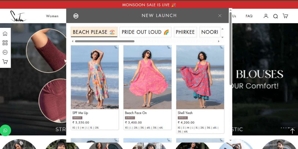
Takeaways from this website popup example:
- User-Initiated Popup: The popup is triggered only when the user clicks on the “New Arrivals” icon, making it user-initiated and non-intrusive.
- Instantly satisfies user intent: It displays a carousel of new products directly inside the popup instead of redirecting to another page. This satisfies user intent instantly and keeps them engaged on the current page.
- Category Tabs for Easy Browsing: The tabs, like BEACH PLEASE, etc., allow users to filter collections without leaving the popup. It creates a mini storefront experience right inside the popup.
- Quick Action Icons: Users can favorite items or add to cart directly from the popup. These quick actions reduce friction and encourage impulse purchases.
7. Click-triggered Add to Cart Confirmation Popup
The Allbirds website popup example enhances the shopping experience by minimizing multiple page navigation.
When the user clicks the add-to-cart button, instead of redirecting, an add to cart popup is displayed. This popup confirms that the item was added. It also gives users two clear choices: check out or continue browsing.
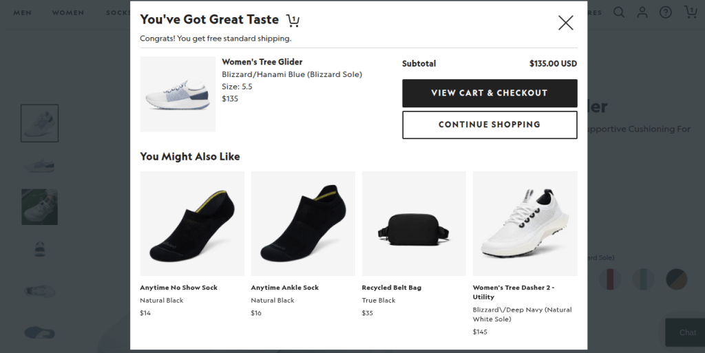
Takeaways from this website popup example:
- Instant confirmation: The popup is triggered instantly after the user clicks “Add to Cart,” confirming the action. This reassures the user that the product was successfully added and improves shopping confidence.
- Product Summary: It provides a clear summary of the added product. This minimizes friction and allows users to stay in control.
- Dual CTA: The popup provides 2 prominent CTAs, “View Cart & Checkout” for ready-to-buy users and “Continue Shopping” for exploring products. This respects both user intents and keeps the shopping journey seamless.
- Cross-Sell Suggestions: Includes a “You Might Also Like” section with complementary product suggestions to increase AOV (Average Order Value).
Related Reading: How to Reduce Cart Abandonment? – 12 Proven Ways.
8. Slide-in Add to Cart Confirmation Popup
This add to cart popup example is a well-balanced mix of upselling, transparency, and ease of use. It increases purchase intent while maintaining a smooth and user-friendly shopping experience.
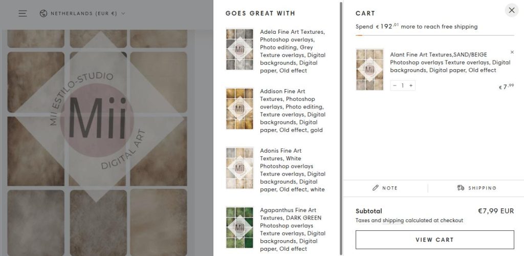
Takeaways from this website popup example:
- Progress-based Incentive: “Spend €192.01 more to reach free shipping” motivates customers to increase their cart value. This upselling strategy increases Average Order Value (AOV) without being pushy.
- Cross-Selling Section: A personalized product recommendation block is shown based on what’s in the cart. It increases the chances of additional purchases by showing related or complementary products.
- Clear Cart Summary: The cart popup shows product name, thumbnail, quantity selector, and price in a clean layout. Additionally, users can change the quantity or remove the item directly in the popup.
- Smooth Shopping Experience: The cart popup appears as a sidebar, allowing users to continue browsing without being redirected. It doesn’t interrupt the flow. However, it provides essential cart information with subtle nudges to take action.
9. Cookie Consent Website Popup Example
In ecommerce marketing, getting consent to collect customer information is mandatory because of marketing consent laws. Popups provide an easy way to get consent without disrupting the user experience.
This PuraVida website popup example displays a consent banner and provides an option to manage users’ preferences.
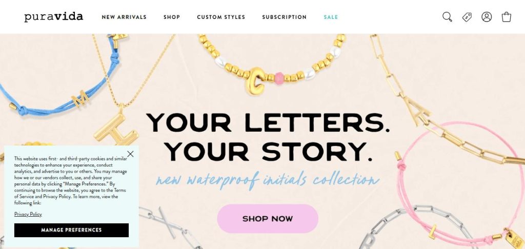
Takeaways from this website popup example:
- Non-intrusive Placement: It’s placed in the bottom-left corner, so it doesn’t interfere with the hero section, navigation, or shopping experience.
- Concise and Informative Content: The message explains what data is collected and why (enhancing experience, advertising).
- Actionable Choices: Visitors are given control with the “Manage Preferences” button, allowing them to customize what they share.
- Link to Full Privacy Policy: A direct link to the Privacy Policy ensures transparency and legal compliance while offering users a way to learn more.
10. Privacy Consent Website Popup Example
Unlike the previous consent banner, this website popup example uses 3 quick action buttons. These buttons help speed up the consent process and improve the user experience.
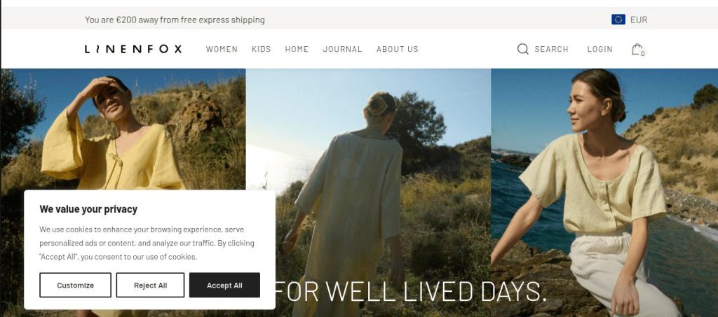
Takeaways from this website popup example:
- Clear Communication of Purpose: The headline “We value your privacy” immediately sets a respectful tone and clearly states the popup’s intent.
- Relatively Unobtrusive Design: While it’s a modal (overlays the content), it’s not full-screen. It balances legal necessity with user experience.
- User Choice and Control: It offers three distinct, clear options: “Customize,” “Reject All,” and “Accept All” to manage preferences in a single click.
11. Full Page Website Popup Example
Full-page popups effectively grab the user’s full attention. But it may disrupt the browsing experience. Hence, they should be used sparingly. Nike’s full-page website popup example utilizes minimalism and whitespace to draw attention to the form.
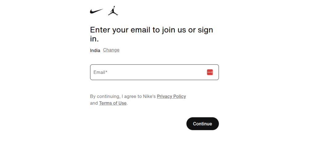
Takeaways from this website popup example:
- Clean, Distraction-Free Layout: No clutter, no product banners, no promotions, just a minimalistic form.
- Universal Entry Point: Enter your email to join us or sign in” keeps it broad, so new and existing users are both addressed. It removes friction there is no need to choose between “Sign Up” or “Log In”.
- Explicit opt-in: “By continuing, I agree…” with links to Privacy Policy and Terms of Use the popup complies with marketing laws.
- Global Personalization: In the popup, you can select your country to enjoy a location-based, personalized experience.
12. Region Redirect Website Popup Example
It’s triggered when a user is trying to access a region-specific version of the site from a different country. This website popup example effectively addresses a common e-commerce challenge: geo-restrictions.
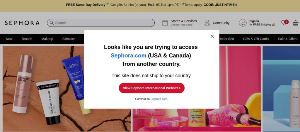
Takeaways from this website popup example:
- Clear Communication of the Issue: The headline is direct and immediately informs the user why they are seeing the popup. It prevents user confusion by clearly explaining the situation.
- Sets clear expectations: The line “This site does not ship to your country” clearly states the limitation. This prevents users from proceeding with an order that cannot be delivered.
- CTA as a Solution: The prominent red button “View Sephora International Websites” provides an actionable solution for the user to find the regional site.
13. Geo-targeted Website Popup Example
For a deal-based service like Groupon, a user’s location is fundamental to providing relevant content. This website popup example directly aligns with the user’s immediate need and the website’s core value proposition.
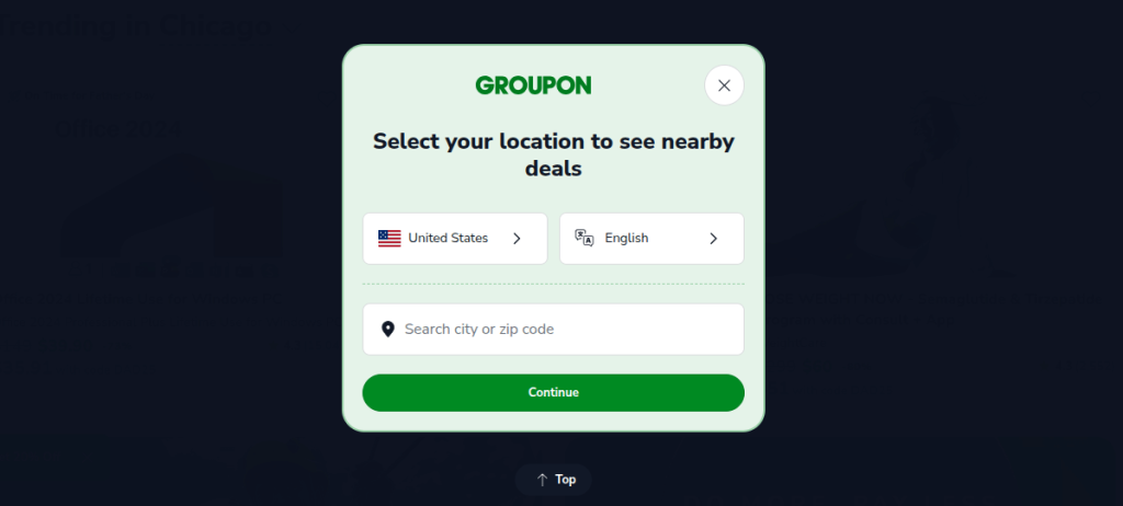
Takeaways from this website popup example:
- Clear Purpose: The headline “Select your location to see nearby deals” is straightforward. It explains the necessity of the popup.
- User-Friendly Input Options: Provides both dropdowns for country and language, and a free-text search field for city/zip code. This way, they can cater to different user preferences and levels of precision.
14. Countdown Website Popup Example
The timer, with a clear discount, makes it an excellent website popup example of urgency-based lead capture.
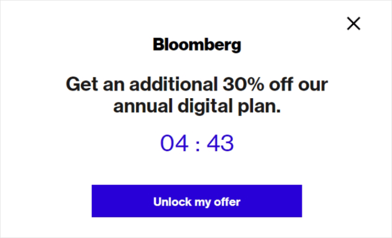
Takeaways from this website popup example:
- Strong Value Proposition: “Get an additional 30% off our annual digital plan” provides instant clarity on the offer. Moreover, the offer appeals directly to price-sensitive users.
- Urgency with Countdown Timer: The countdown timer (04:43) creates FOMO, encouraging users to take immediate action before the offer expires. Limited time = quick actions.
- Minimal Design, Maximum Focus: Clean, distraction-free layout draws attention to the offer and the timer. Only one action to take means zero confusion.
15. Exit intent Website Popup Example to Collect Feedback
Waitrose’s website popup is a well-mannered, respectful way to collect customer opinions. It focuses more on trust and transparency than conversion.
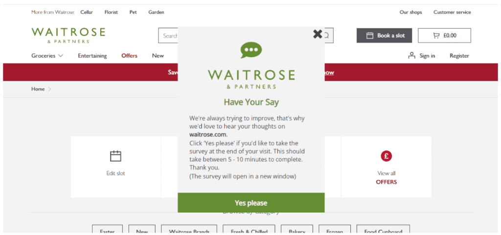
Takeaways from this website popup example:
- Time Expectation Set: “Should take between 5–10 minutes” sets clear expectations, reducing drop-off mid-survey.
- Non-Intrusive Design: Small, centered popup that doesn’t obstruct the full website experience. Easily dismissible with a visible close (“X”) icon.
- Brand-Consistent Style: Uses Waitrose’s font, colors, and logo. Feels native to the site.
Website Popup Templates
Building popups does not require you to be a pro at coding and designing. You can just customize pre-designed templates using a drag-and-drop editor.
Here we have shared some of the high-converting templates of welcome popups, Discount popups and Seasonal popups from Retainful. Besides these 3 categories, you’ll get access to the newsletter, add to cart, and exit intent popup templates.
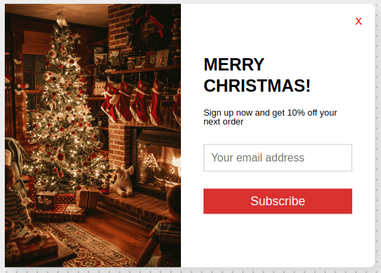
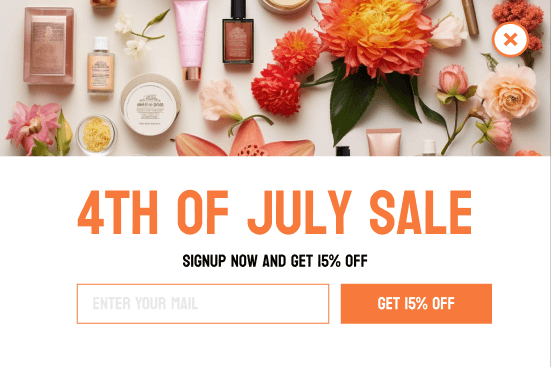
1. Welcome Popups:
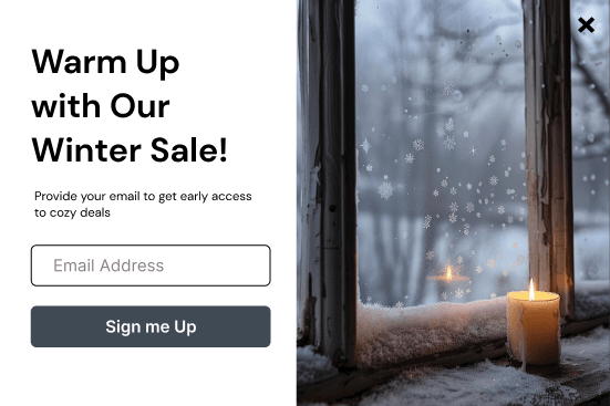
2. Discount Popups:
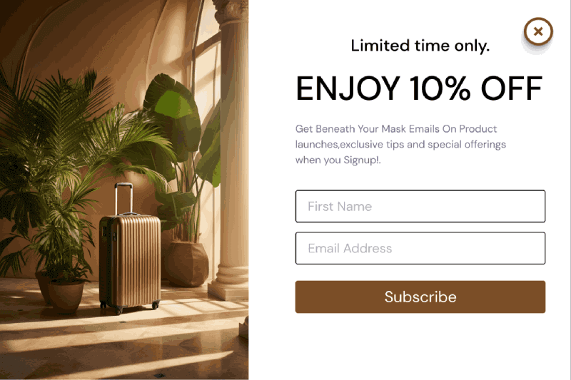
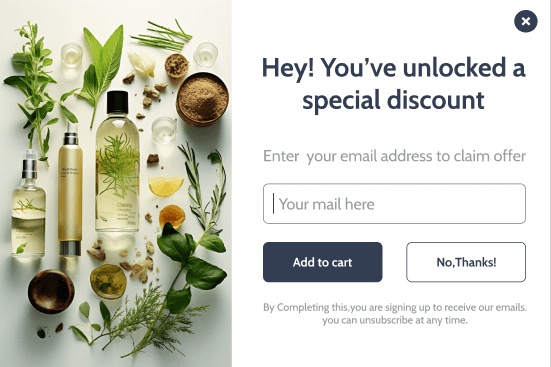
3. Seasonal Popups:

Launch smart, targeted popups using Retainful now and increase conversions effortlessly.
Wrap Up!
Creating well-timed and non-intrusive popups like the mentioned examples is not as complex as it seems.
To get started, you can use popup building tools like Retainful.
It offers:
- 100+ pre-designed popup templates.
- Advanced trigger settings (Time delay, scroll percentage, click triggered, exit intent, add to cart)
- Smart targeted popups (target visitors based on location, language, and even the number of visits)
- Drag and drop popup builder.
Also Read
- 15 Best Newsletter Signup Examples to Grow Your Email List
- How to create a Shopify newsletter signup form?
Frequently Asked Questions
Use exit intent, time-delayed, or user-triggered popups with clear CTAs. Provide mobile optimization and easy-close options to maximize effectiveness.
Yes, they still work when designed well, with relevance, timing, and user-friendly behavior.
Add a visible close button, limit frequency, and avoid intrusive timing like instant popups.
Trigger after 5–10 seconds, on scroll, or on exit intent to engage users without disrupting their experience.
Popups can affect user experience adversely if they are intrusive.
Discounts, free shipping, exclusive deals, or early access to products convert best.
Display popups only once per session or every few days for a user.
Popups are separate windows or overlays; modals are embedded within the site and often require user interaction.
Include consent checkboxes, link to privacy policy, and only collect necessary data.