Industry data reveals a startling truth: static emails are losing their punch, while interactive emails are seeing up to a 300% increase in click-through rates.
The pain point is clear: Marketers are working harder than ever to design beautiful campaigns, only to see engagement flatline because the “click-to-site” hurdle is too high.
Every time a user has to leave their inbox to load a slow landing page, you lose a potential sale.
This article is your definitive guide to solving that friction. You’ll get a clear idea of what interactive elements to use and how to send interactive emails.
Let’s dive in.
What are interactive emails?
Interactive emails contain functional elements that let recipients engage with the email within the inbox.
In addition to creating engagement, interactive elements in the email design can capture customer’s attention and increase the user experience.
Join the top 1% of brands using interactive emails to drive a 300% lift in CTR with Retainful’s customizable email templates.
6 Benefits of sending interactive emails
Email interactivity is a performance multiplier that turns your inbox into an extension of your product.
Look at what Jonathan Martinez, founder of GrowthPair, says about the interactive emails.
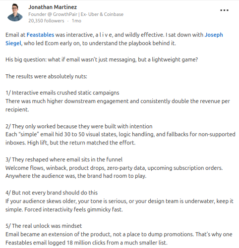
According to industry data and real-world results from high-growth brands like Feastables, here are 6 reasons why your next campaign should have interactive emails:
- Exponential Click Through Rates (CTR)
- Frictionless Conversions (The “Inbox-to-Cart” Pipeline)
- Massive Revenue Lift
- “Zero-Party” Data Collection
- Optimized Mobile Experience
- Enhanced Brand Recall
1. Exponential Click Through Rates (CTR)
The most immediate benefit of interactivity is its ability to break the “scroll-and-delete” habit.
- The Data: Adding video or interactive elements to your email can increase click rates by up to 300%.
- Real-World Success: A single interactive Feastables campaign logged 18 million clicks from a relatively small subscriber list.
- Why it works: It transforms the recipient from a passive observer into an active participant, lowering the psychological barrier to engagement.
2. Frictionless Conversions (The “Inbox-to-Cart” Pipeline)
Every extra click or page load is a chance for a customer to drop off.
- The Data: Interactive content generates 2x more conversions than traditional static content.
- Why it works: By allowing users to “Add to Cart” or select product options directly in the email, you eliminate the friction of slow-loading landing pages and browser redirects.
Transform your emails into high-performance micro-apps using Retainful’s email templates and email editor.
3. Massive Revenue Lift
The engagement generated by interactive emails translates directly to the bottom line – Email ROI.
- Double the Revenue: Case studies show that interactive campaigns consistently generate double the revenue per recipient compared to static campaigns.
- Direct Sales: Moving the sales funnel into the inbox allows for “web-like” functionality that drives up to 520% higher user response rates compared to standard landing pages.
4. “Zero-Party” Data Collection
In a world of tightening privacy laws (GDPR, CAN-SPAM), getting data directly from the user is invaluable.
- The Data: Interactive polls and surveys see an average engagement increase of 73% over static links.
- Deeper Insights: A “simple” interactive email can hide 30 to 50 visual states and logic handlers, allowing you to capture complex preferences and high-intent interaction data.
5. Optimized Mobile Experience
With over 80% of emails opened on mobile, space is at a premium.
- The Data: Using elements like Accordions or Carousels can reduce email length by up to 60%, which correlates with a 15% increase in unique mobile clicks.
- Why it works: It allows you to pack a “mile-long” email’s worth of info into a single, swipeable screen, preventing “scrolling fatigue”.
Related reading: Responsive email: How to Design + Tips
6. Enhanced Brand Recall
Interactivity changes how subscribers perceive your brand.
- The Unlock: Email becomes a lightweight game or a product extension rather than just a place to dump promotions.
- Lasting Impression: 81% of marketers agree that interactive content is more effective at grabbing attention, leading to higher brand affinity and “moments of delight” for the customer.
Related reading: Spotify Marketing Lessons Ecommerce Brands Can Learn (2026)
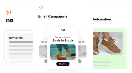
10 Types of interactive elements to add to an email
Here are 10 types of interactive elements to add to your email:
- Accordions – Collapsible content
- Image Carousels
- Start rating and NPS – Net promoter score
- Polls, quiz and forms
- Add to cart
- Cart recovery and checkout
- Clickable GIFs and videos
- Live countdown timer
- Hover effects
- Gamified elements
Turn your next campaign into an interactive destination where users can shop using Retainful’s easy-to-set-up campaigns.
A quick chart showing which interactive elements to use in each type of email
| Category | Elements Included | Primary Benefit |
| Layout & Space | Accordions, Image Carousels | Cleaner mobile experience. |
| Data & Feedback | NPS, Polls & Quizzes, Forms | Collects feedback and “Zero-Party” data. |
| E-commerce | Add to Cart, Checkout | Shortens the path to purchase. |
| Engagement | Gamification, Hover | Boosts time-spent-in-email. |
| Visual Dynamic | Clickable Video/GIFs, Live Timers | Creates urgency and “pop.” |
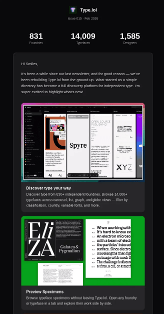
1. Accordions – Collapsible content
Accordions (or collapsible content blocks) are a mobile marketer’s best friend. This element allows you to stack information vertically, hiding the details behind a clickable header.
When a user is interested in a specific topic, they simply tap to “expand” the content.
Accordions are perfect for sending email newsletters, release notes, and feature updates, as you can structure your content and let the reader expand the content that they want to read.
Here is an example of an Accordion in an email from Type.lol. In this email example, when a user clicks a specific section, it expands to show more information with a “View on Type.lol” CTA.
2. Image carousels & Interactive galleries
Image carousels and interactive galleries allow you to display multiple high-resolution visuals within a single constrained area.
Instead of forcing users to scroll through a “mile-long” email, they can engage with a sliding or clickable “lookbook.
How It Works
Using AMP for Email or advanced CSS, you can create “bullets,” “next/previous” arrows, or a clickable grid. This lets the subscriber cycle through different products, lifestyle shots, or trend reports in one go.
Here is an example of an interactive image grid from MusicBed.

Best use cases for image carousels:
- Trend Reports & Portfolios: As seen in the Musicbed layout, you can showcase multiple “stills” or video thumbnails from a report. This gives the reader a “sneak peek” of the variety of content available before they click the main CTA.
- E-commerce marketing:Show the same product from four different angles or in five different colors in a single block.
- Storytelling: Use each slide to represent a step in a “How-to” guide or a chronological brand story.
Why do interactive image carousels work?
- Declutters the Inbox: It keeps your primary message “above the fold” while still providing depth for interested users.
- Native Mobile Behavior: Users are already conditioned to swipe on Instagram and TikTok; bringing that “swipeable” logic to email makes the interaction feel intuitive and seamless.
- Increased Engagement: Because there is a natural human instinct to “see what’s next,” carousels often see higher interaction rates than static images.
Pro-Tip: In a gallery like Musicbed’s, ensure the images look “tappable” by adding a slight hover effect or a play icon overlay.
Related reading: How to Embed Images in Emails (Guide + Best Practices)
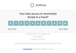
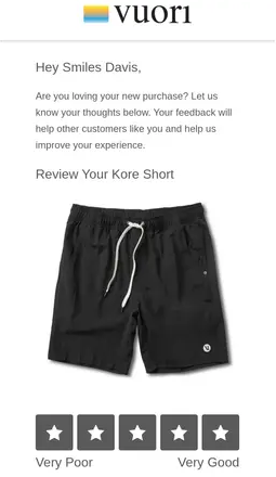
3. Start rating and NPS – Net Promoter Score
Instead of sending users to an external site where drop-off rates are high you can capture their sentiment in a single click with start rating or NPS.
NPS and star ratings are widely used in collecting feedback and reviews from your customers. In ecommerce and email marketing, it is a staple in post purchase workflows to ensure customer satisfaction and loyalty.
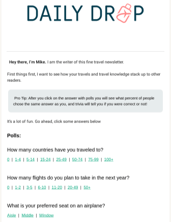
4. Polls and Quiz
Polls
Quizzes and polls are the “hook, line, and sinker” of interactive email.
They invite your audience to share their opinions or test their knowledge without ever having to click away to a third-party survey site.
Interactive polls use clickable links or radio buttons that record a user’s choice instantly. Many brands use these to provide “instant gratification” by showing the live poll results as soon as the user votes.
Quiz:
Quizzes turn a standard promotional email into a personalized discovery tool. Instead of telling a customer what they need, you let them discover it for themselves.
How It Works
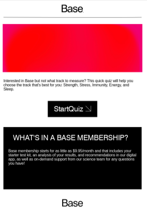
In the Base example, the email uses a “Start Quiz” call-to-action to help users identify which health track (Strength, Stress, Immunity, Energy, or Sleep) is best for them.
This can be done via a direct link to a web-based quiz or, in more advanced setups, by allowing the user to answer the first few questions directly inside the email body to build momentum.
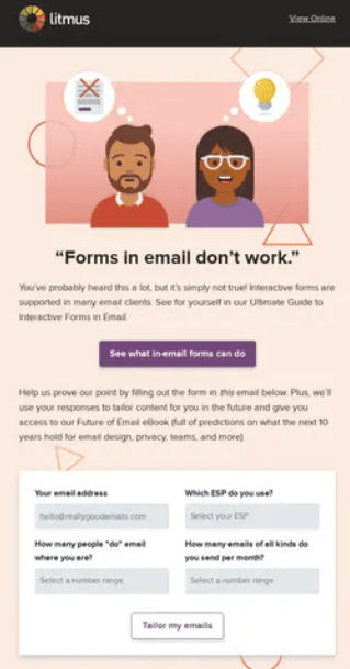
Forms
Unlike polls and quizzes forms in email let’s you use text fields, drop downs and checkboxes to capture information.
5. Add to cart
The “Add to Cart” interaction is the ultimate friction-killer for e-commerce. By bringing the checkout process into the email, you reduce the number of steps between “I want this” and “I bought this.”
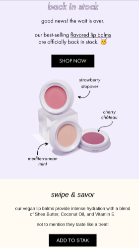
How it works
Using advanced CSS or AMP for Email, the “ADD TO STAK” button in this example can be configured to communicate directly with the brand’s e-commerce platform.
When the user taps it, the product is added to their cart in the background, and the email can even update to show a “View Cart” confirmation or a success message.
When to use it?
- Back in stock alerts: As seen in the Stak example, when a best-selling item (like flavored lip balm) returns, a direct “Add to Cart” button captures the immediate excitement of the customer.
- Personalized recommendations: If a user consistently buys or browses a specific product, send them a one-click personalized email to order.
- Limited edition drops: Use the “Add to Cart” feature for high-demand items where every second counts for the consumer.
Related reading: Email Segmentation: Complete Guide for 70% More Revenue
6. Cart recovery and checkout
Interactive cart recovery emails, like the alo “Missed Connection” example, use dynamic grids to remind users of what they left behind while suggesting “cuties” (related items) to sweeten the deal.
In a fully interactive version, the “CHECKOUT NOW” button triggers a secure, in-email overlay where the user can confirm their shipping and payment details without ever leaving the Mail app.

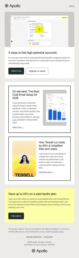
7. Clickable videos and GIFs in emails
While we often think of video or GIF in email as a consumer-facing trick, the Apollo example proves it is equally powerful for B2B and educational content.
It transforms a “how-to” guide into a visual classroom.
Top 3 Benefits of adding an interactive video to an email
- Instant Engagement & “Stopping Power”: Motion grabs attention instantly and breaks inbox fatigue. A looping GIF or video thumbnail with a clear play button makes readers pause and look.
- Frictionless Education & Trust: Video explains complex ideas faster than text and is easier to consume. Showing a real person or product interface builds instant credibility and trust.
- Higher Click-Through Rates (CTR): A play icon is a universally recognized CTA. Emails with video cues naturally encourage more clicks than static content.
8. Live countdown timers
Adding a live countdown timer is the most effective way to inject real-time urgency into your subscriber’s inbox.
Unlike static text that says “Ending Soon,” a live timer creates a visual “ticking clock” that compels immediate action.
How it works
Countdown timers are dynamic images that update in real-time every time the email is opened.
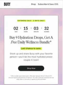
In the Bugy example, the timer prominently displays the days, hours, minutes, and seconds remaining in their “Extended Sale,” creating a sense of FOMO (Fear Of Missing Out) that drives users toward the “Shop Now” button.
Best use cases
- Flash Sales:Use a timer to count down the final hours of a limited-time offer, just like Bugy does for their hydration drops.
- Event Deadlines: Create urgency for webinar registrations or early-bird ticket pricing.
- Product Launches: Build anticipation by counting down to the exact second a new collection drops.
9. Hover effects
Hover effects are the most subtle yet satisfying form of email interactivity. They provide “micro-feedback” to the user, signaling that an element is live and clickable.
How it works
Hover effects utilize CSS (specifically the :hover selector) to change the appearance of an element when a mouse pointer passes over it.
This can include color shifts, button shadows, or image swaps. While primarily a desktop feature, they set the tone for high-end brand experiences.

10. Gamified elements
Gamification in an email can transform a passive reader into an active participant.
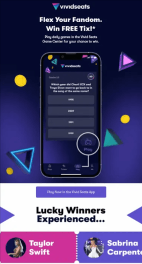
In the Vivid Seats example, the email invites users to “Flex Your Fandom” by playing daily games in their Game Center for a chance to win free tickets.
This email marketing strategy uses an email as a portal, featuring a music-themed trivia question with clickable multiple-choice answers.
How to use gamification in email?
- Trivia Challenges: Use pop-culture or industry-specific trivia—like the Vivid Seats music quiz to build a daily habit with your subscribers.
- Progress Bars & Milestones: Show users how close they are to a reward (e.g., “3 more purchases until your next free gift”) to encourage repeat behavior.
- Spin-to-Win Wheels: Common in “Welcome” flows, these allow users to “spin” for a discount code directly within the email interface.
How to create an interactive email?
Here are the 4 steps to create an interactive email:
- Choose your interactive framework
- Design frictionless action
- Implement visual feedback
- Prioritize fallbacks
1. Choose your interactive framework
There are two primary ways to build interactivity today:
- AMP for Email: This is the most powerful method for functional interactivity. It allows for real-time data updates, such as live countdown timers or in-email forms that submit data without a page refresh.
- Advanced CSS/HTML: For visual interactivity like hover effects or image carousels, developers use “Checkbox Hacks” or CSS :hover selectors to trigger changes when a user interacts with an element.
2. Design frictionless action
The goal of interactivity is to reduce the “click-to-site” hurdle.
- Embedded Forms: Use fields for email addresses or ESP preferences to collect “Zero-Party Data” directly.
- One-Click Carting: Include “ADD TO CART” or “CHECKOUT NOW” buttons that communicate with your e-commerce backend to simplify the purchase path.
- Gamified Elements: Incorporate trivia or “Flex Your Fandom” challenges to turn a standard promotion into a memorable event.
3. Implement visual feedback
Interactive emails should “talk back” to the user to confirm their actions:
- Hover States: Ensure buttons change color or gain shadows (like the “Book a demo” example) to signal they are clickable.
- Video Cues: Use play button overlays on GIFs or video stills as seen in the Apollo and Musicbed layouts to drive users toward rich media content.
4. Prioritize fallbacks
Not every email client (like older versions of Outlook) supports interactivity.
- Static Backup: Always design a “fallback” version of the email that displays a standard button or image if the interactive code fails to load.
- Graceful Degradation: If a live countdown timer cannot render, ensure it defaults to a static “Sale Ending Soon” banner.
7 Key interactive elements in email signature
Your email signature is often the last thing a customer sees. It serves as a “mini-app” that enables instant connection and data management without requiring the user to search your website.
In addition to this, email signature is where you can showcase your trust badges.
Key interactive components
- Live social portals: Instead of just text links, use high-contrast, interactive icons for platforms like LinkedIn, X, or Instagram. Adding a hover effect (like the shadow shift we saw in the “Book a demo” button) provides tactile feedback that these icons are live.
- One tap preference center: A “Manage Preferences” button is a powerful tool for retention. It leads to an interactive form where users can “Snooze” emails for 30 days or select only the topics they care about, capturing vital Zero-Party Data.
- Frictionless unsubscribe: To maintain high deliverability and comply with 2026 inbox standards, the unsubscribe link must be clear and interactive. Making this process easy actually reduces “spam” complaints and keeps your sender reputation healthy.
- Dynamic banners: Use “mini-billboards” to promote webinars or sales that update automatically.
- Direct meeting links: Embed “Book a Call” buttons (e.g., Calendly or HubSpot) to turn interest into scheduled meetings instantly.
- Live chat buttons: Add a “Chat with Me” icon that links to WhatsApp or Intercom for immediate communication.
- QR codes: Include a small QR code that links to a virtual business card (vCard) for easy mobile saving
How to create interactive email signature?
1. Use tables for layout
In web design, we use Flexbox or Grid , but in email, those often break.
To keep your interactive elements like a grid of product categories or side-by-side video thumbnails from jumping around, you must use nested tables.
- Why? Tables are the only layout structure that behaves consistently across all versions of Outlook and Gmail.
- The Structure: Use <table>, <tr> (rows), and <td> (columns). Set a max-width: 600px for the main container to ensure it stays readable on mobile.
2. Inline styling
Standard websites use an external CSS file. Most email clients will ignore that file entirely. You must apply your styles directly to every single HTML tag.
- Example: Instead of a separate stylesheet, you write:
<td > - Pro tip: This ensures that even if a client “clips” your email, the parts that remain will still have the correct branding and colors.
3. Creating the interaction
To make things “happen” inside the email (like a gallery that changes images or a button that glows), we use two main CSS tricks:
- The hover state: For clients that support it (Apple Mail, Gmail Desktop), use a <style> block in the <head> to define : hover classes. This is how you create the shadow-shift or color-change on buttons like “Book a Call” or “Checkout Now”.
- The checkbox hack: For interactive galleries or accordion menus, developers use a hidden <input type=”checkbox”>. When a user clicks a “tab,” it toggles the visibility of different content blocks without leaving the email.
4. Dark mode optimization
Over 40% of users view emails in Dark Mode. If you don’t optimize, your logos and interactive icons (like your Social Portals) might vanish into the black background.
- Transparent PNGs: Always use transparent backgrounds for icons and logos.
- The “Glow” Trick: Add a subtle 1px or 2px white “stroke” or outer glow to dark logos. In Light Mode, it’s invisible; in Dark Mode, it ensures your logo stays crisp and readable.
- CSS Queries: Use @media (prefers-color-scheme: dark) to swap background colors or text colors specifically for dark-themed devices.
5. Technical fallbacks
Interactivity doesn’t work everywhere. If a user opens your email in an old version of Outlook, your interactive video or carousel might not load.
- Graceful Degradation: Always include a “Fallback” block. If the CSS-powered gallery doesn’t work, ensure the code defaults to showing a simple, high-quality static image with a standard link.
- The “View in Browser” Link: Always include this at the top so users on restricted email clients can still experience the full interactive version of your message.
Challenges and workarounds in creating interactive emails
Creating interactive emails in 2026 is exciting but tricky. While features like in-email checkouts or video galleries can jumpstart engagement, they don’t work everywhere.
Here are the 5 main problems you’ll face and how to fix them:
1. Outlook compatability
Apps like Apple Mail and Gmail handle interactive code well, but the desktop version of Outlook uses an old system that ignores modern CSS. Your hover effects or carousels just won’t show up.
Graceful Degradation: Always build a “Backup” version. If the interactive carousel doesn’t work, the code should automatically switch to a simple list of images that everyone can see.
2. Visibility in dark mode
Over 40% of people use Dark Mode. Email apps often flip your colors automatically, which can make your buttons or icons disappear against a dark background.
Add a thin, light-colored border (stroke) around dark icons so they stay visible.
Use specific code (@media) to tell the email exactly which colors to use when Dark Mode is turned on.
3. Security Bots Mess Up Your Stats
Many companies use security software that “clicks” every link in an email to check for viruses. This makes it look like 100% of your audience is interacting with your email when they actually aren’t.
Use “Honeypot” links; the invisible links that only a bot would click. If that link is clicked, you know to ignore that data. Also, look at how long people stay on the page rather than just counting clicks.
4. Making it Accessible for Everyone
New laws (like the European Accessibility Act) require emails to work for people using screen readers. Many interactive games or “hidden” reveals are impossible for screen readers to understand.
Use Alt Text to describe what every button and video does.
Make sure buttons are large enough (44×44 px) so they are easy to tap for everyone.
5. Gmail clipping limit
Interactive code is heavy. If your email file is larger than 102KB, Gmail will cut off the bottom of the email. This hides your unsubscribe link and can break your interactive features.
Keep your code clean and simple. Use a single-column layout and host large items (like videos) on your website instead of trying to pack too much into the email itself.
Wrap up!
Interactive emails have shifted the landscape from simple messaging to immersive brand experiences.
Remember, the goal of interactivity isn’t just to look “cool”. It’s to drive measurable ROI by meeting the user exactly where they are.
Start small with a hover effect or a live poll, monitor your data to filter out those pesky security bots, and scale your efforts as you see your conversion rates climb.
Also read:
- 10 Churn prevention strategies & software to 3x customer retention in 2026
- Targeted email marketing to 2x conversions in 2026: Steps, benefits, examples
- 11 Best ecommerce advertising platform in 2026 (Comparison chart)
Frequently asked questions
Not every email client supports advanced interactivity. While Apple Mail and Gmail handle most elements well, older versions of Outlook may display a static version. This is why we use “graceful degradation” to ensure every user sees a high-quality fallback.
No, provided your code is clean. In fact, because interactive emails drive higher engagement and fewer “spam” reports, they can actually improve your sender reputation. Just ensure your HTML file stays under the 102KB limit to avoid clipping.
Yes. Modern frameworks like AMP for Email are designed with strict security protocols. For sensitive actions like checkouts, the interactivity usually acts as a secure bridge to your encrypted payment processor.
Most modern ESPs (Email Service Providers) can track interactions via “logic handlers.” For more complex data, you can use unique tracking pixels or intent-based analytics that monitor time-spent-in-email.
While the “Manual Route” offers the most control, tools like Stripo or MailerLite now offer drag-and-drop modules for carousels, polls, and hover effects, making interactivity accessible to all marketers.