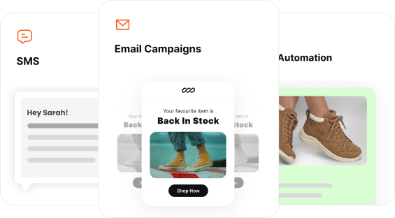
Every business is into email marketing, and all the emails & discounts look the same. So how do you stand out in the inbox? – It’s through email design best practices
In fact, email design can influence which tab your email will land in. For example, an email can land in spam if it has too many images or a bigger file size. It’s not the only reason for you to pay attention to email design.
Here is a list of things the best practices of email design do for your email marketing campaigns:
- Reflect your brand values.
- Grab your subscribers’ attention.
- Convey the message effectively.
- Drive more traffic and sales.
- Looks neat, beautiful, and mobile responsive.
So the bare minimum in email design is not enough.
In this article, you’ll find 10 must follow email design best practices for better open rates and conversions. You’ll also find answers to some of the technical difficulties in implementing a good email design.
Let’s dive in.
Design high-converting emails effortlessly using Retainful’s ready-made email templates and drag-and-drop email editor.
10 Email design best practices for better deliverability and Communication
Email design plays a major role in influencing your email marketing metrics. A good email design will improve open rates, click-through rates (CTR), and overall engagement.
The 10 best email design best practices are:
- Start with a high-performance master template
- Attention grabbing subject line and preview text
- Structure Your Email Design
- Email Design Best Practices for CTA
- Check for Dark and Light Mode Compatibility
- Balance your Visuals and Text
- Responsive mobile friendly Email Design
- Email Copy Best Practices
- Consistent Brand Identity
- Credible Email Footer Design
Start with a high-performance master template
Creating an email design from scratch may sound like it offers more control, but it often leads to “broken” emails. Different email clients (like Outlook, Gmail, and Apple Mail) render HTML and CSS differently.
Using a master email design template is the single best practice for ensuring your campaign looks professional across every inbox.
The benefits of master templates:
- Cross-client compatibility: Master templates are pre-tested to ensure that complex layouts don’t “break” in older versions of Microsoft Outlook or the Gmail mobile app. This level of compatibility and performance optimization is often achieved with the support of experienced mobile development companies , ensuring seamless rendering across devices and platforms.
- Prevents Gmail clipping: Gmail truncates emails with a code size larger than 102KB. High-performance templates use clean, minified HTML to ensure your entire message (including your CTA and footer) is visible.
- Inline CSS optimization: Unlike web design, email requires inline CSS to render correctly. A good template handles this “inlining” for you, ensuring fonts and colours stay on-brand.
- Built-in mobile responsiveness: A master template provides the “skeleton” needed for vertical stacking on mobile devices without you having to write a single media query.
- Pro Tip: Maintain a “Template Library” Don’t just have one. Create a modular library for ecommerce marketing:
- Transactional: Minimalist, high-utility for order refund, order confirmation, shipping updates and order cancellation.
- Automated emails: Restock alerts, Welcome emails, newsletter templates, flash-sale alerts.
- Trigger based: Dynamic blocks for Abandoned Carts.
- Seasonal: Branded “lookbooks” for Black Friday, Spring Sales and discount announcements.
Related reading: 30 Best email marketing examples that drive sales
Attention grabbing subject line and preview text
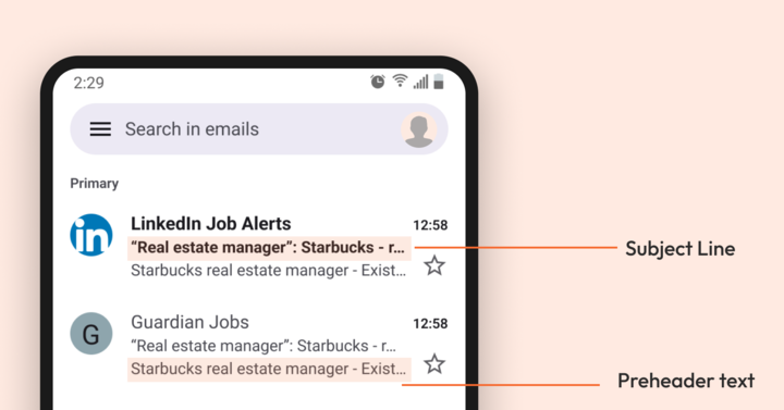
The “Intelligent Inbox” (Google & Apple) prioritises emails based on immediate relevance.
Your subject line and pre-header text are the technical signals that determine if your email is seen or relegated to a secondary tab.
Here are the email design best practices to be followed in subject lines and pre-headers:
- Personalization: Include your client’s name in the subject line using dynamic codes to make your email feel more personal.
- Value: Convey the most important information of your email in your subject line. In simple terms, front load your subject lines.
- Lower case bias: Many 2026 marketers use all-lowercase subject lines (e.g., question about your order) because they mimic internal human communication, which bypasses “Promotional” AI sorting.
- Emoji strategy: Use one high-impact emoji (like 📦 for shipping or ✨ for news) to stand out, but avoid “stacking” them, which triggers modern spam alerts.
- Spam filters: Ensure that your subject line is free from spam-triggering words like Urgent, Act Now, and too many emojis. It will impact your email deliverability significantly.
- For example, here is how a good and a bad subject line look:
- ❌ “Our new sustainability report is out.”
- ✅ “How are we reaching Net Zero by 2030?”
- In general, most email clients pull the first line of your email body as a pre-header. However, it is not ideal in email design best practices.
- Do not state the subject line again in the pre-header. Instead, write a preview text including numbers, discounts, or highlighting the value of the email.
What is the recommended number of characters for a subject line?
The recommended length for an email subject line in 2026 is 30 to 45 characters. While desktop clients can display up to 60 characters, staying under 45 ensures that your entire message is visible on mobile devices.
What is the recommended number of characters for preview text?
The recommended length for preview text is 35 to 55 characters.
While some desktop clients display up to 90 characters, the majority of mobile devices (iOS and Android) truncate text after the 50-character mark.
How do I prevent “View in Browser” from appearing in the preview?
A common design flaw is when the “View in browser” link or “Logo alt-text” leaks into the inbox preview. To avoid this:
- The Preview Hack: Use a “hidden preheader” (a div with display:none;) at the very top of your HTML code.
- The Buffer Technique: If your preview text is short, add a string of non-breaking spaces ( ) after your text to push the “View in browser” link out of the visible preview area.
Structure your email design
Your email design layout must be structured and convey the message within seconds.
Your email structure and email layout design are crucial for proper rendering and scannability of your email content. To effectively structure your email design, stick to the standard email dimensions and highly scannable layouts.
What is the best width for marketing emails in 2026?
The “safe” standard for email width remains 600px to 640px.
While desktop monitors are huge, email clients like Gmail and Outlook often display emails within a “preview pane” that constrains the width.
Sticking to 600px ensures your email won’t require horizontal scrolling, which is a major red flag for user experience.
The standard dimensions for emails:
| Element | Recommended size | Purpose |
| Email width | 600px – 640px | Cross-client compatibility. |
| Header height | 50px – 150px | Branding without pushing content “below the fold.” |
| Hero banner | 600px x 300px (or 400px) | High-impact visual at a 2:1 or 3:2 ratio. |
| CTA | Min. 44px x 44px | The “Apple Standard” for easy thumb-tapping. |
| Max height | 1500px – 2500px | Keeps the file size light and engagement high. |
How do people scan emails?
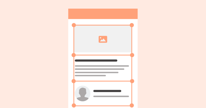
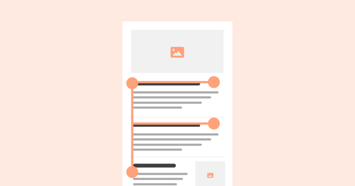
Users don’t read; they scan or skim content. To capture attention in under 3 seconds, use these three proven layout patterns:
Here are scanning patterns in email design layouts:
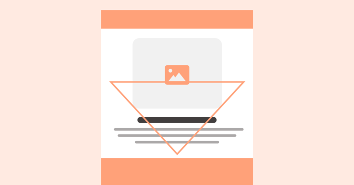
- Inverted Triangle: It starts wide at the top with a bold headline, narrows with supporting text, and ends with a clear CTA.
- Zig-Zag Layout: Ideal for eCommerce emails. It alternates image and text placement (left-right-left), guiding readers’ eyes through your content.
- Column layout: Column wise layout is good at presenting information packed emails like email newsletters. It presents information in a clutter free and clear layout.
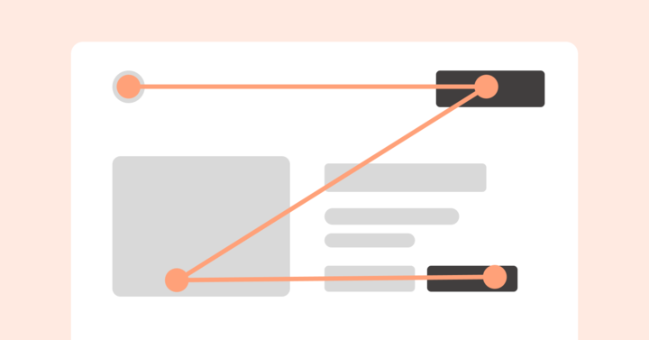
- F-Pattern: People’s eyes naturally scan digital content in an F-shaped pattern. In the F-pattern layout, readers scan across the top line first, then down the left side, occasionally glancing across again if something grabs their attention.
Pro tip: Use visual hierarchy in your email design layout.
Headings followed by subheadings and body text, finally ending with a CTA.
Headings → Subheadings → Body → CTA.
Email newsletter design best practices: dimensions and formatting
Based on email newsletter design best practices, your layout should balance density with readability.
What are the ideal email newsletter dimensions in pixels?
The standard for email newsletter size is 600px wide. Your newsletter length can vary based on content. The best email newsletter dimensions for engagement are between 1500px and 3000px in height.
If your newsletter exceeds this, it is highly recommended to use “Read More” anchors to avoid the 102KB Gmail clipping limit and keep the layout from becoming a “wall of text.”
Newsletter formatting best practices:
- Use a multi-column grid (desktop only): For newsletters with multiple stories, a two-column grid helps categorize content. However, ensure your code uses vertical stacking so these columns shift to a single-column view on mobile devices.
- The “Table of Contents” technique: If your newsletter covers more than three topics, include a small, clickable “In this issue” list at the top. This significantly improves the structure of the email for busy readers.
- Consistent gutter spacing: Keep a 20px padding (gutter) between your text and the edge of the 600px container. This is a key part of how to create an email newsletter that people want to read. It prevents the content from looking “cramped” on narrow screens.
Save time and skip the guesswork with Retainful’s professionally designed templates that follow proven layout patterns.
Email design best practices for CTA
CTAs (calls to action) are important in email design because they guide your readers toward the next step. A clear CTA increases engagement. It helps convert your email goals into measurable actions.
What is the ideal button size for mobile emails?
The ideal button size is at least 44px by 44px. This follows the “Fat Finger Rule” (the Apple Accessibility Standard), ensuring that users can easily tap the CTA on a mobile screen without accidentally clicking a nearby link.
Additionally, you should leave at least 20px of whitespace (padding) around your button to prevent “mis-taps” and make the action stand out visually.
CTA best practices for email design
- Use a clear and action-oriented CTA text like “Start Your Free Trial” or “Shop Now.”
- Avoid overwhelming the reader with multiple CTAs. One strong, focused CTA performs better than many weak ones.
- CTA visibility: Make your CTA button large enough to tap on mobile, and use a contrasting color to make it stand out. Add enough whitespace around it to draw attention.
- Your CTA should align with your email’s purpose. For example,
- Promotional email – “Shop the Sale”
- Abandoned cart – “Complete My Purchase”
- Welcome email – “Set Up My Account”
- CTA position:
- At the top – Place your main CTA at the top of the email so people can see it without scrolling.
- Middle – Add a CTA in the middle only if it flows naturally with the content.
- At the end: Include a CTA at the end of your email.
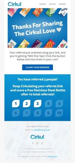
- For example, the email from Cirkul features an action-driven CTA styled in a high-contrast blue to grab attention.
NOTE:
Many marketers still use images for their buttons because they want custom fonts. However, this is a mistake for two reasons:
- Image Blocking: If a user hasn’t “enabled images,” your CTA will be invisible.
- Dark mode: Image-based buttons often have a white “box” around them in dark mode, making the design look broken.
The Solution: Use an HTML/CSS button. It loads instantly, is always visible, and can be easily styled to change colours in Dark Mode automatically.
Check for dark and light mode compatibility
Many users switch between light and dark modes depending on device settings or personal preference.
If your email design is not suited for both modes, your design can look distorted. As a result, it affects readability, branding, and engagement.
Here are the best practices in email design for light and dark modes:
- Avoid Pure Black or White Text: Utilize off-black and off-white for better readability.
- Brand Logo Visibility: Include dual logos (light and dark versions) or add a subtle outline for visibility.
- Transparent PNGs: Instead of a white background in images, opt for transparent images.
- Gradients: Gradients might look completely different in dark mode. Test for consistency or use subtle gradients.
Dark mode best practice in email design
If your logo is dark or black, it will completely disappear when an email client inverts the background to black.
- The Fix: Add a 2px white stroke (outline) or a subtle white glow to your transparent PNG logo.
- Why it works: In Light Mode, the white outline is invisible against the white background. In Dark Mode, that same outline ensures your logo “pops” and remains legible against the dark background.
Balance your visuals and text
Email layouts have limited space. Strategically, use it to include your images and text. Pictures and GIFs are good for retaining customer attention, whereas text conveys the message effectively.
The 60/40 rule in email design
The 60/40 rule states that your email should consist of 60% live text and 40% images. Maintain 60% live (searchable) text, to prove the inbox provider that your content is legitimate and accessible.
Email image best practices
Here are email design best practices for including images to improve your email design performance:
| Feature | Best Practice | Why? |
| Format | WebP (Primary) or JPG | WebP offers 30% better compression than JPG without losing quality. |
| File Size | Under 100KB per image | Ensures fast loading on 5G and avoids “laggy” scrolling. |
| Alt-Text | Descriptive & Keyword-rich | Necessary for screen readers and displays if the image is blocked. |
| DPI/Resolution | 72 DPI | Screens can’t display 300 DPI (print quality); it only adds unnecessary weight. |
NOTE: Ensure the images are responsive and compatible with dark and light modes.
How to handle Image Licensing?
Using “found” images from Google is a major legal risk. Copyright bots are faster than ever at scanning emails.
- Source correctly: Use reputable stock sites (Unsplash, Pexels) or licensed libraries (Getty, Adobe Stock).
- Save the License: Keep a record of your licenses. If a copyright claim arises, you need to prove the “Right to use” in digital marketing.
- Avoid “Stocky” Vibes: 2026 users prefer “Lo-Fi” or authentic-looking photos over polished, generic stock photography. High-quality user-generated content (UGC) often performs better than a licensed studio shot.
What is the recommended quantity of licensed images for a marketing email?
For optimal performance, limit yourself to 3 to 5 high-impact licensed images per email.
- Spam trigger threshold: Using more than 5 images significantly increases your risk of being flagged by AI filters as “image-only” spam.
- File size threshold: Every additional image adds to the total file size. Keeping your image count low ensures your email stays under the 102KB Gmail clipping limit.
Email text best practices
Here are email design best practices to be followed for text elements:
- Avoid huge paragraphs in your email. Instead, you can opt for bullet points, numbered lists, icons, and short paragraphs. Ideally, 2-3 sentences max.
- Use line-height: 1.4 to 1.6 to keep your content breathable.
- Ensure you are using an appropriate font size for easy reading. For body text font size of 14–16px is ideal.
- Make sure headings are visually distinct with a larger size or bolder weight.
- Opt for contrasting text colour for better visibility.
Responsive mobile friendly email design
Most of us check our emails on our mobile devices. This means that one of the key elements in email design practices is using a mobile-friendly, responsive email design layout.
Here are the mobile friendly email design best practices :
- Choose templates that automatically adjust to screen size.
- Make sure elements stack vertically on smaller screens.
- Multi-column layouts can look cramped on mobile.
- Stick to a single-column layout to keep things clean and scannable.
- Ensure you use an appropriate font size for your text elements for readability on mobile. Ideally, headings – 22px or larger, and body text should be 14px.
How to make my email design responsive for mobile and desktop?
The most effective way to ensure responsiveness is to use a Mobile-First approach. Instead of designing for a wide desktop screen and trying to “squeeze” it down, design for a narrow 320px screen first.
To achieve this technically, use CSS Media Queries or a Fluid-Hybrid (Spongy) Layout:
- Media Queries: These tell the email client: “If the screen is smaller than 480px, change the layout.”
- Fluid-Hybrid: This uses percentage-based widths (e.g., width: 100%) combined with a max-width: 600px. It works even in email clients (like some versions of Outlook and Gmail) that sometimes “strip” media queries.
What is vertical stacking?
Vertical stacking is the process of taking side-by-side elements (like two product images) and moving them one on top of the other for mobile.
- Desktop: Two columns (300px each).
- Mobile: One column (100% width, stacking the second image below the first). This prevents the “pinch and zoom” frustration, keeping your text large enough to read without any horizontal scrolling.
Responsive email design checklist
| Feature | Best practice | Purpose |
| Breakpoint | 480px | The standard width where a layout should shift from multi-column to single-column. |
| Touch Targets | 44px x 44px | Minimizes “fat finger” errors on touchscreens. |
| Font Scaling | 16px (Mobile) | Standardizes legibility; iOS often “auto-scales” text smaller than 13px, breaking layouts. |
| Padding | 20px Gutter | Provides a “safe zone” so text doesn’t touch the edge of the phone screen. |
Email copy best practices – Conversational and human-centric copy
Email copy and email design best practices should go hand in hand for running successful email marketing campaigns.
Here is a breakdown of email copy best practices:
- Write for scanning: Use short paragraphs, bullet points, and headings.
- Make your content easy to skim with key information at the top.
- Benefit-Driven Copy: Instead of listing features, focus on benefits. Instead of saying “Additional 128 GB storage space,” say something like “Store an extra 1,000 songs”. It’s more relatable and benefit-focused.
- Ensure you use a tone that aligns with your brand identity and is conversational. Use email personalization to make your message feel like it’s from a friend, not a business.
- Don’t overload it with too many main features. Have a spotlight on one main feature and provide supporting sentences, images, and an actionable CTA.
Pro tip:
- To make your email copy more relevant and relatable to each group of your audience, use email segmentation strategies.
- Use the “You” Rule. If the word “We” or “Our” appears more than the word “You” or “Your,” your copy is too brand-centric. Flip the narrative to focus on the recipient’s benefit to see an immediate lift in engagement.
- A major 2026 trend is the “Hybrid Plain-Text” design. It looks like a personal email (minimalist, lots of white space, standard fonts) but includes a single, high-contrast CTA.
Related reading: How Simple Emails Lead to More Sales
How to optimize email for better CTR using copy?
The secret to higher CTR is Intent-Based Copywriting. Instead of describing what you are selling, describe what they are achieving.
- The first person CTA: Change your buttons from “Buy Now” to “Get My Discount” or “Start My Journey.” Data shows that using first-person language in CTAs can increase clicks by up to 20%.
- Micro-copy matters: Use small “utility” text under your buttons to reduce friction (e.g., “No credit card required” or “Free shipping included”).
Consistent brand identity
Brand identity helps people recognize your emails easily. When your emails look and feel the same every time, it builds trust, familiarity, and makes your brand feel more reliable.
Here are the best practices in email design for maintaining brand consistency:
- Brand colours and font: Use your brand’s primary colour palette and typography across all emails.
- Logo placement: Position your logo prominently (usually in the header).
- Keep your tone uniform: Whether you’re friendly, professional, or quirky, your copy should always reflect your brand personality.
- Use branded templates: Create reusable templates that align with your brand style. This ensures that every campaign looks familiar and polished.
- Consistent layout: Use a consistent structure for headers, CTAs, and footers. Familiar formatting makes your emails easier to recognize.
How do I get my company logo to show in Gmail and Apple Mail?
To display your logo in the inbox (Gmail’s “Blue Checkmark” or Apple’s “Branded Mail”), you must follow these three steps:
- Strict authentication: Your domain must have SPF, DKIM, and DMARC set up. Crucially, your DMARC policy must be set to p=quarantine or p=reject.
- BIMI compliant SVG: Your logo must be a specific file type – SVG Tiny 1.2. It must be a square (1:1) image with a solid background (no transparency for BIMI-Brand Indicators for Message Identification).
Credible email footer design
The footer in email design plays a crucial role in both legal compliance (GDPR) and user experience.
Here is a list of best practices in email design to be followed in the footer:
- Include essential info: Add your company name, physical address, and contact details to stay compliant and build trust.
- Add unsubscribe link: Always include a visible unsubscribe link to follow email marketing laws like CAN-SPAM and GDPR.
- Link to social media: Add social icons to let subscribers connect with you on other platforms.
- Keep it clean and readable: Use a clear layout and font size so your footer is easy to read on both desktop and mobile.
- Optional links: You can also include links to your privacy policy, terms of service, or help center.
How do I optimize my email footer for branding and conversions?
In 2026, the footer is more than just a legal requirement; it’s a “trust anchor.” To optimize it:
- Brand consistency: Include a monochrome version of your logo to reinforce identity without cluttering the space.
- The preference centre” link: Instead of just a “Unsubscribe” button, include a “Manage Preferences” link. This reduces churn by letting users choose how often they hear from you.
- Social proof & tust: Add a physical address and clear contact links. This isn’t just for CAN-SPAM compliance; it signals to AI inbox filters that you are a legitimate, reachable business.
Start using Retainful for free to design responsive and converting emails effortlessly.
Apply email design best practices
Email design best practice is a must-do if you want to improve your email campaigns. To do it, you need the right email customization software.
That’s where Retainful comes in, making it easy to design high-converting emails effortlessly.
With Retainful, you get :
- 100 + ready-made customizable templates
- Responsive e-commerce email templates
- Beginner-friendly drag-and-drop email editor
- Dynamic content for personalization
- Easy to use Shortcodes
Moreover, before sending your emails from Retainful, you can preview how they look on different devices.
Whether you want to keep your branding consistent or make sure your emails look great on mobile, Retainful has you covered.
It lets you follow all the email design best practices without any restrictions.
Also Read
- How to check competitors’ email marketing & ad campaigns in 2026
- E-commerce Infrastructure Checklist: Speed, Security, and Stability
- 20 Best Valentine’s Day marketing ideas for 2026 (Backed by data)
Frequently asked questions
Keep your total HTML file size under 102KB. If your code exceeds this, Gmail will “clip” your email, hiding your footer and unsubscribe link, which can lead to spam complaints and legal compliance issues.
Stick to Arial, Helvetica, Verdana, or Georgia. While many clients support Google Fonts, these “system fonts” ensure your layout doesn’t break if a recipient’s device fails to load external assets.
Aim for under 125 characters. This is the standard “safe zone” for screen readers. Be descriptive (e.g., “Summer Sale 50 percent off red sneakers”) rather than using generic terms like “banner.”
Use a line height of 1.5 to 1.6 (150%–160%). This provides enough “white space” between lines to prevent text from looking cluttered on small mobile screens.
Use them sparingly. Many versions of Outlook do not support background images. If you use one, always set a solid fallback background color that contrasts well with your text.
Use 72 DPI. Higher resolutions (like 300 DPI used for print) only increase file weight without improving visual quality on digital screens.
