Mobile popups convert 74.27% more than desktop popups. However, the common sentiment of people towards popups is to close them as soon as they appear.
So, as a marketer, creating popups on mobile without frustrating users is a challenge. To create such effective lead-generating mobile popups, in this article, we’ve covered:
- Mobile popup best practices
- How you can create a high-coverting popup
- Google’s mobile friendly guidelines for popups
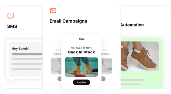
Create stunning popups within minutes using Retainful’s 100 + pre-designed mobile popup templates.
What is a Mobile Popup?
Popups on a mobile is a small interactive window that appears while browsing a website or an application. Unlike desktop popups, mobile popups are designed to fit smaller screen sizes and support touch-based interactions.
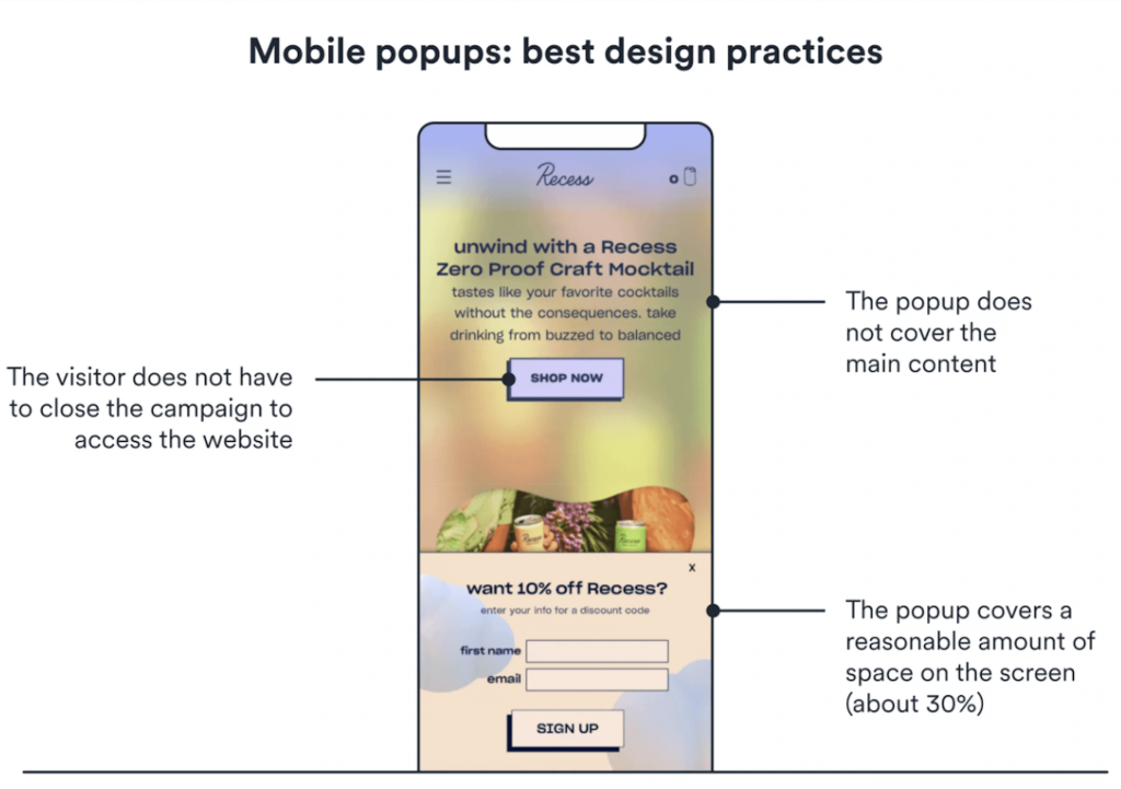
Ideally, mobile popups should only occupy about 30% of the screen and must never block users from accessing the content.
In ecommerce marketing, mobile popups serve multiple functions.
To name a few:
- Capturing email addresses
- Displaying Announcements, updates and offers.
- To recover abandoned cart
- Driving more sales
- Generating Leads
Related Reading: What is Email Marketing? – An Ultimate Beginner’s Guide
How To Create Mobile Popups That Convert?
Creating a high-converting mobile popup blends design, psychology and technical execution. As a marketer or an ecommerce owner, you can create it using popup builders.
Here are the steps to create a high-converting popup on mobile:
Step 1: Choose Your Popup Builder
Step 2: Select a Mobile Optimized Template
Step 3: Concise and Effective Message
Step 4: Set Triggers and Target of Your Popup
Step 5: Preview and Publish
Launch smart, targeted popups using Retainful now and increase conversions effortlessly.
Step 1: Choose Your Popup Builder
Your popup builder is the basis of your mobile popup.
Look for the following features:
- Drag and Drop interface to build your popup.
- Mobile optimized popup templates
- Different types of popups like Add-to-cart, exit-intent, welcome popups.
- Targeting capabilities like language-specific, region-based and behavioral targeting.
- Audience segmentation for targeting
- Analytics and reports
One tool that ticks all the above mentioned features is Retainful. Moreover, Retainful mobile popup templates are specifically designed for ecommerce requirements. In this section, we’ve shared how you can create custom mobile popups using Retainful.
Step 2: Select a Mobile Optimized Template
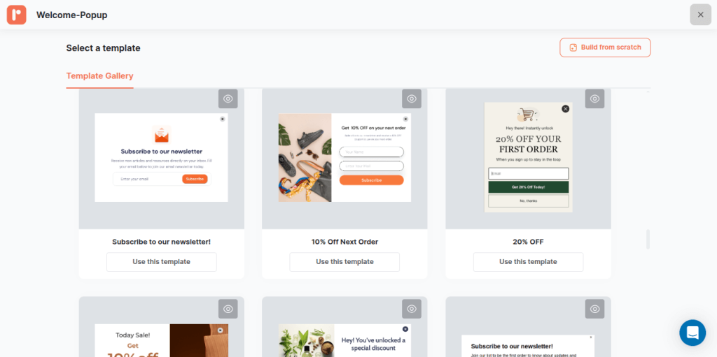
Mobile-friendly popup templates are designed with single-column layouts, larger tap targets, and vertical designs that are ideal for mobile viewing. Retainful offers over 150+ such pre-designed templates.
Here’s how you can access it:
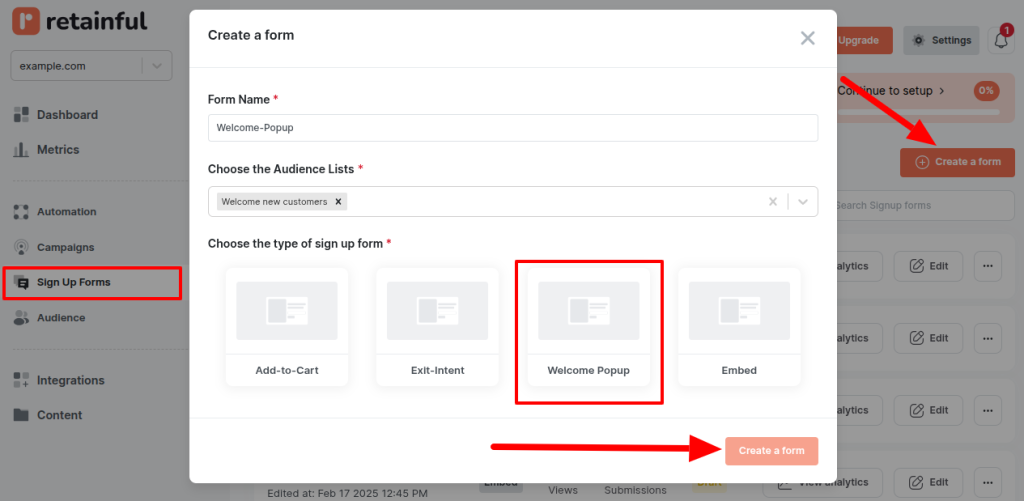
In your Retainful dashboard, select the Sign Up Forms option and click on Create Form.
In the Create a Form overlay, you can provide a name and select the type of your popup type. For this illustration we’ve chosen the Welcome popup.
You’ll be redirected to the template gallery, where you can select your mobile-friendly popup template.
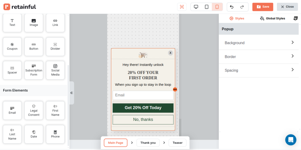
Step 3: Customize Your Mobile Popup Template
Once you’ve chosen your template, in the drag and drop editor you can customize the popup for your brand.
In the editor, you can add different layouts, form elements like legal consent, and form fields (phone number, email address).
Moreover, you can modify every aspect of your popup from color, button, spacings, and text. Click on Save to apply all your changes in the template.
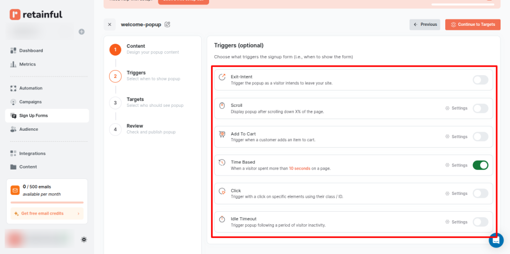
Step 4: Set Triggers and Target of Your Popup
To ensure a good user experience and compliance to Google’s guidelines, set triggers. In the Trigger settings, you can set when your popup should display.
You can enable the following settings:
- Exit – intent
- Time delayed
- Scroll depth
- Add to cart
- Click based
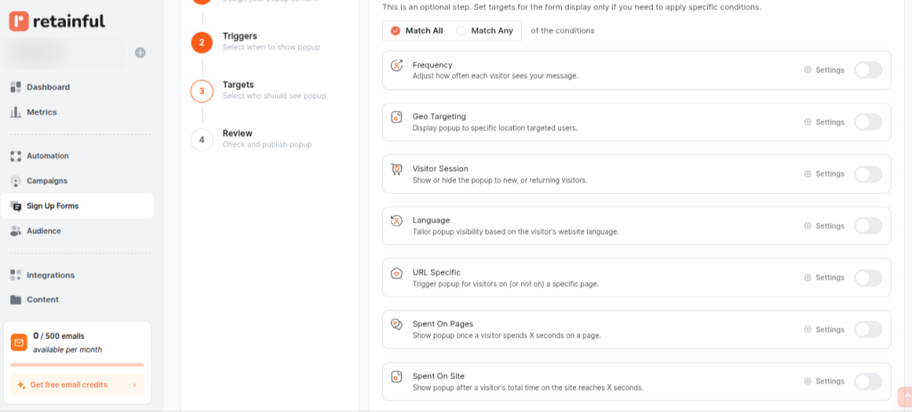
In addition to the trigger settings, you can optionally set the target conditions for specific audiences.
You can set the following target settings:
- Frequency – how often a visitor sees your popup
- Geo-targeting – target specific regions
- Visitor Session – Hide the popups to returning customers
- Language – Tailor popup visibility based on the visitor’s website language
- URL Specific – When a user visits a certain page
- Spent on pages – a user spends X amount of time on a specific page.
- Spent on Website – spends X amount of time on the website
Related Reading: 10 Email Frequency Best Practices For 2025
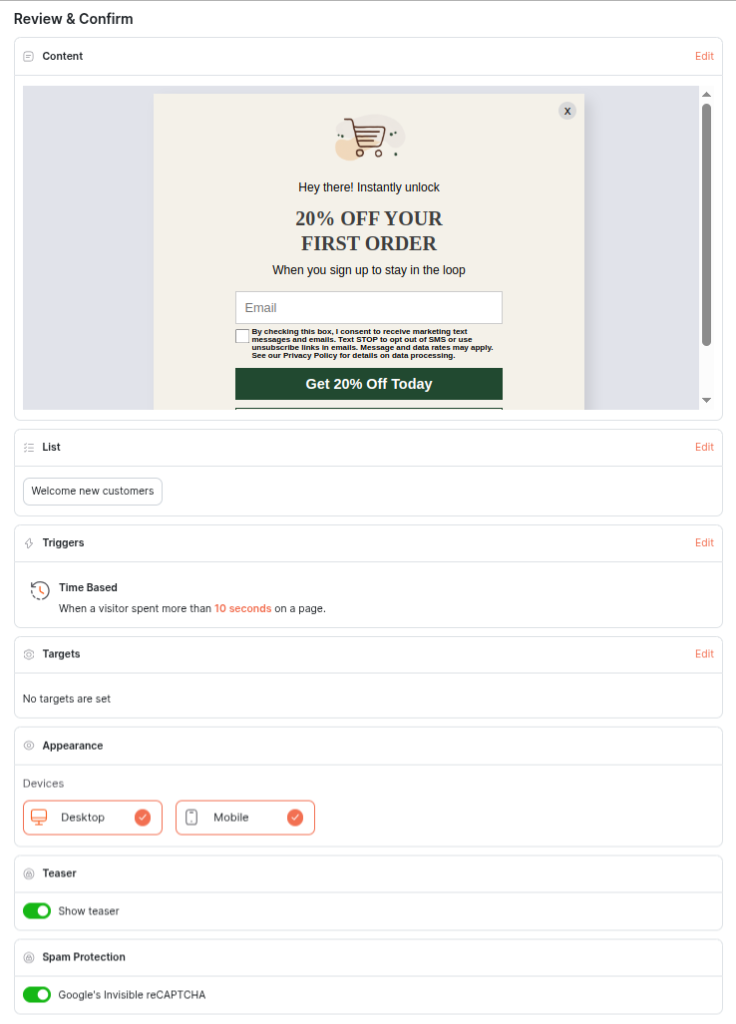
Step 5: Preview and Publish
You can preview and enable captcha settings. Moreover, you can also configure appearance settings – Mobile view and desktop view.
10 Mobile Popup Best Practices
Over 95% of people access the internet through their mobile phones but, many mobile popups still disrupt the user experience. Designing mobile popups with a user-first mindset is critical for conversions and retention.
Here are 10 best practices to follow when creating mobile popups:
- Prioritize Google Compliance & Non-Intrusive Popup Formats
- Design For Thumb Interactions
- Reduce Form Fields and Collect Only What’s Necessary
- Implement Clear & Prominent Closing Options
- Offer an Irresistible Discount
- Use Concise and Benefit-driven Copy
- Leverage User-triggered Popups
- Limit Popup Frequency
- Personalize Popups based on User-behavior
- A/B Test For Different Segments
1. Prioritize Google Compliance & Non-Intrusive Popup Formats
Google explicitly penalizes mobile pages that display “intrusive interstitials” that block main content. Especially, displaying full screen popups when the user has just arrived from the search results will result in a penalty.
However, legally required cookie consents and age verification popups will not be penalized as long as they are easily dismissible. This isn’t just an SEO concern; it directly impacts user experience and trust. Since cookie consent banners are a legal requirement in many regions, understanding what is cookie compliance is essential for marketers using mobile popups to ensure privacy regulations are met without harming conversions.
Below is a non-intrusive mobile popup example
Here’s What To Do
Full screen popups may disrupt browsing experience. So, instead of using full screen overlays, opt for:
- Sticky banners and Footers – Sale Announcements and discount popups
- Notification bars – Cookie Consent and privacy options
- User-triggered and exit-intent popups – To capture email addresses, time-sensitive offers and recover abandoned carts.
Use full screen overlays ONLY if you want to grab the user’s full attention. Even if you’re displaying full screen popups use an action triggered or a time-delayed popup.
2. Design For Thumb Interactions
Mobile browsing is primarily a thumb-driven experience. Ignoring the fact of how users hold and interact with their mobile phones leads to accidental clicks and frustration.
Position all your interactive elements like input fields, close icons and CTAs within the thumb zone. The thumb zone is on the bottom-center and right side of the screen.
In addition to the position of your popup on the mobile, the size of the interactive elements is also important. Ensure all tappable areas are generous in size (minimum 48×48 pixels) to prevent “fat-fingering.”
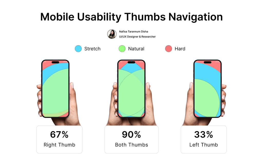
Each mobile device is different but an ideal size for a popup on mobile would be 360 x 660 pixels.
Related Reading: 10 Email Design Best Practices for 2025
3. Reduce Form Fields And Collect Only What’s Necessary
Every additional field on a mobile popup increases friction and drastically reduces conversion rates. Typing on a mobile keyboard is inherently less convenient than on a desktop.
Here’s What To Do:
- To generate leads initially, use a single input field.
- For signups and logins use autologin options like “Signup with Google” to reduce friction.
- You can get additional details like phone number and address after an intended task is done (during checkout or exit-intent).
- Leverage auto-fill capabilities and appropriate keyboard types (e.g., numeric keypad for phone numbers) to improve the mobile popup’s usability.
4. Implement Clear & Prominent Closing Options
Users should never feel trapped by a popup. A hidden or difficult-to-find close button will increase bounce rates and negatively impact brand perception.
Here’s What To Do:
- Actionable Insight: Include a highly visible, large “X” icon in a predictable location (typically the top-right corner).
- Complement the close icon with a clear text-based “No thanks,” “Close,” or “Dismiss” link. Ensure padding around these elements for easy tapping.
- Some advanced popup builders offer “swipe-to-close” functionality. It mimics native app behavior and provides a highly intuitive dismissal method for mobile users.
5. Offer an Irresistible Discount
Irrespective of desktop or mobile popups, providing a valuable exchange is crucial. If the offer isn’t compelling, the popup is just an unwelcome interruption.
Here’s What You Can Offer:
- Fixed amount discount with minimum order value
- Percentage discount coupon code
- Free Shipping
- Early Bird Access for launching products
- BOGO (Buy One Get One)
- Downloadable Guides
In addition to what you’re offering, how you’re presenting your discounts can make your popups more fun. Consider gamified popups like “spin-to-win” wheels, which can increase conversion rates by 13.23%. Moreover, it adds an element of fun and perceived chance.
Related Reading: 10 Best Discount Email Templates + Examples
6. Use Concise & Benefit-driven Copy
Mobile users scan, they don’t read long blocks of text. Your message needs to be immediately understood and compelling.
Write headlines that grab attention and instantly communicate the core benefit. Follow with just one or two supporting sentences that elaborate on the value. Use strong action words and emojis to clearly convey the actions and emotion.
Here are some free mobile popup copies that convert:
Welcome Popup
Unbox Your Welcome Gift!
Join our community and get 15% off your first purchase, plus exclusive early access to new arrivals.
CTA: Unlock my Discount
Secondary Action – No thanks, I’ll pay full price.
Exit-intent Popup
Wait! Don’t Miss Out.
Leaving so soon? Here’s a final treat just for you. Get 10% off your entire order before you go.
CTA: Claim My 10% OFF
Secondary Action: No thanks
Cart Recovery Popup
Hey! Your Cart is Waiting.
Don’t let these items sell out. Complete your order now and get free shipping on us.
CTA:Go to Checkout
Secondary Action:No thanks, I’ll check out later.
7. Leverage User-triggered Popups
This is arguably the most user-friendly and Google-compliant popup strategy, as it puts the user in control.Instead of automatically displaying a popup, have a small, Call-to-Action button or icon visible on the page.
The popup only appears after the user clicks it, indicating explicit interest. Moreover, on-click popups have the highest conversion rate of 22%.
8. Limit Popup Frequency
Interrupting the user's task with frequent popups is the quickest way to lose them. Limit your popup frequency to one popup per user per session. You can use cookies to remember if a user has seen or dismissed a popup.
However, consider different frequency caps for different types of popups. For example, a very high-value, exclusive offer might warrant being seen more frequently than a newsletter signup.
Also, avoid showing signup popups to users who are already subscribed.
9. Personalize Popups based on User-Behavior
Generic popups perform poorly. Relevance is key to cutting through the noise and making your offer resonate. Personalized popups can improve conversion rates by as much as 49%.
Segment your audience and personalize popup content based on user behavior, such as:
- Page Visited: Show a discount for a specific product category if they're Browse that category.
- Referral Source: Offer a special welcome if they came from a specific social media campaign or ad.
- Returning vs. New Visitors: Provide a loyal customer perk for returning users or a first-time discount for new ones.
- Cart Contents: Trigger a unique offer (e.g., free shipping or a small discount) if they have items in their cart and are about to leave
Related Reading: Email Personalization - Strategies & Examples that Work
10. A/B Test For Different Popup Elements
Never assume your first design is the best. Continuous testing is the only way to truly optimize performance.
A/B test different elements of your mobile popup:
- Timing and frequency
- Popup type (Slide-ins or modal popups)
- Number of fields
- Mobile Popup Content and Visuals
- Triggers (On-click/ exit-intent..)
- Discounts (Free shipping/percentage discounts.)
Test your popups in different devices before publishing your popup.
Google's Mobile-Friendly Guidelines For Popups
Based on Google's official documentation and various expert analyses, here are the key guidelines for mobile popups.
What Google Considers Intrusive (and Penalizes):
- Full-Screen Popups: Popups that cover the entire screen, preventing users from viewing the content they clicked on.
- Standalone Interstitials: A page that the user has to dismiss before they can access the main content.
- Popups that appear immediately: Any popup that is triggered the moment the page loads, forcing the user to interact with or close it before seeing the content.
What Google Considers "Acceptable”:
- Legal Obligations: Popups that appear in response to a legal requirement.
- Login Dialogs: Popups that are necessary to access content that is not publicly indexable. For example, private content or pages behind a paywall.
- Small, Easily Dismissible Banners: Banners that take up less space and are easy for the user to close. These are often seen at the top or bottom of the screen and do not obstruct the primary content.
- User-Triggered Popups: Popups that appear after a user has actively clicked on a button or link. This shows the user's intent and is not a sudden interruption.
Create smart popups with Retainful that are triggered based on visitor behavior and convert casual visitors to subscribers.
Wrapping Up!
Creating a popup on mobile is easier than ever with tools like Retainful. But if it converts or frustrates your user it is entirely on the best practices and design of your popup.
The bottom line is a good mobile popup will have the following:
- Compliance to Google’s popup guidelines
- Mobile friendly design
- Provides value to the user
- Lets user be in control (user-initiated popups)
- Easy to close
Also Read:
- Email Automation: An Ultimate Guide for Beginners 2025
- 15 Website Popup Examples That Convert(+ Free Templates)
- 10 Popup Best Practices + Examples
Frequently Asked Questions
Yes, offering discounts, freebies, or exclusive access can significantly boost popup conversions.
A popup should cover no more than 30% of the screen and must not obstruct access to main content.
The best timing is based on user behavior like exit intent, scroll-depth, or click triggers, not immediate page load.
Avoid intrusive full-screen popups, ensure easy dismissal, and use user-triggered or delayed popups.
Pop-ups are typically enabled via website settings or third-party popup tools, and they must be optimized for mobile responsiveness.
