Did you know your brain makes a snap judgment about a product in under 90 seconds? And color sways up to 90% of that first impression. It’s not just pretty paint on a wall—color psychology in marketing shapes how people feel and buy, turning a simple glance into cold, hard cash.
This silent language works deep in our minds. It nudges emotions without a word. Brands that nail it see sales soar, while others fade into the background.
Foundations of color psychology in commerce
Humans see color before anything else. Our eyes catch light waves, and the brain fires off quick reactions. In marketing, this turns into a tool that boosts sales and builds loyalty.
Science backs it up. Studies show color hits the emotional center fast. Marketers use this to craft messages that stick.
From billboards to apps, color guides choices. It’s no accident that big companies pick their shades with care.
Let color do the selling—drive clicks and recover more sales with Retainful.
How colors shape first impressions in under three seconds
People don’t start by reading your site — they react to it. In just a few seconds, color does all the talking. Before your words even register, color sparks trust, interest, or curiosity. Sometimes, it pushes people away before they’ve read a single line.
- Color hits us right away, shaping how we feel about a brand. It’s like a silent filter, helping our brains decide: does this look trustworthy, exciting, calming, or maybe a bit fancy?
- A smart color palette pulls the eye where you want it — to the call-to-action, the price, the product’s best features. It ties your brand together, too. Even if someone’s just skimming, your colors leave a mark.
- Colors set the tone. They hint at whether you’re premium, playful, eco-friendly, or all about tech. The right mix of contrast and harmony makes everything clearer. Content feels easier to take in. Products pop, but nothing feels too much.
- Keeping your colors consistent builds trust. People feel safer and more confident as they click from page to page. Certain colors stick in our minds, locking in your message and the feeling behind it.
- Color cues make choices easier. They gently push shoppers from browsing to buying, cutting down on hesitation. When your colors match what people hope to feel, they move faster — and you see more sales.
Emotional triggers behind every shade — Why certain colors convert better
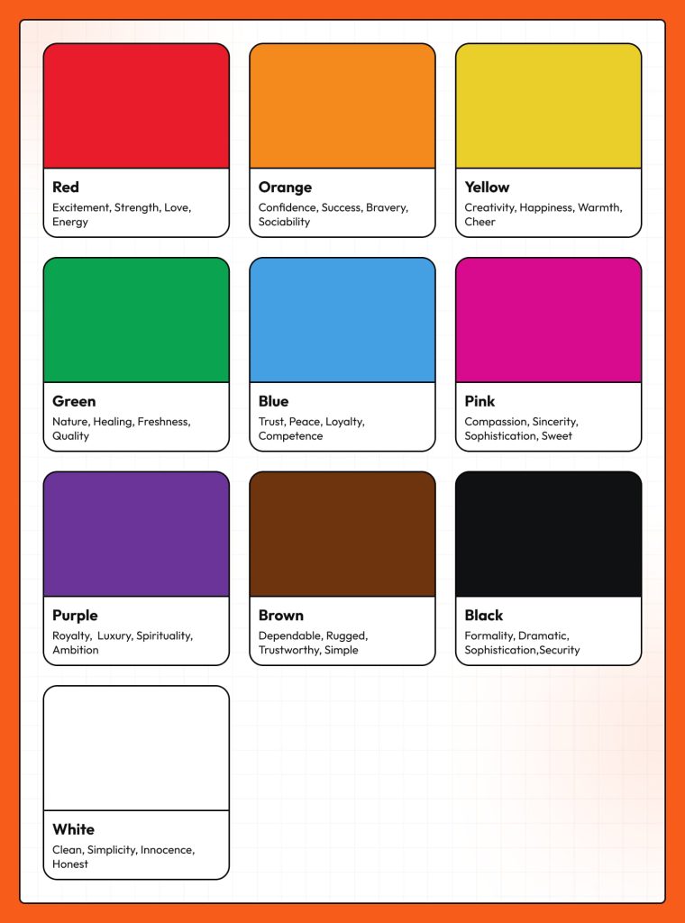
🔴 Red – Urgency, excitement & instant action
What it represents: Red hits the brain like a siren — urgency, energy, and heat. It speeds up heart rate and pushes impulse decisions.
How brands can use it: Use red for flash-sale badges, countdown timers, clearance banners, and high-urgency CTAs (“Shop Now,” “Last Chance”). It works especially well in email promotions and hero banners where you want users to act right now.
Brands using red effectively:
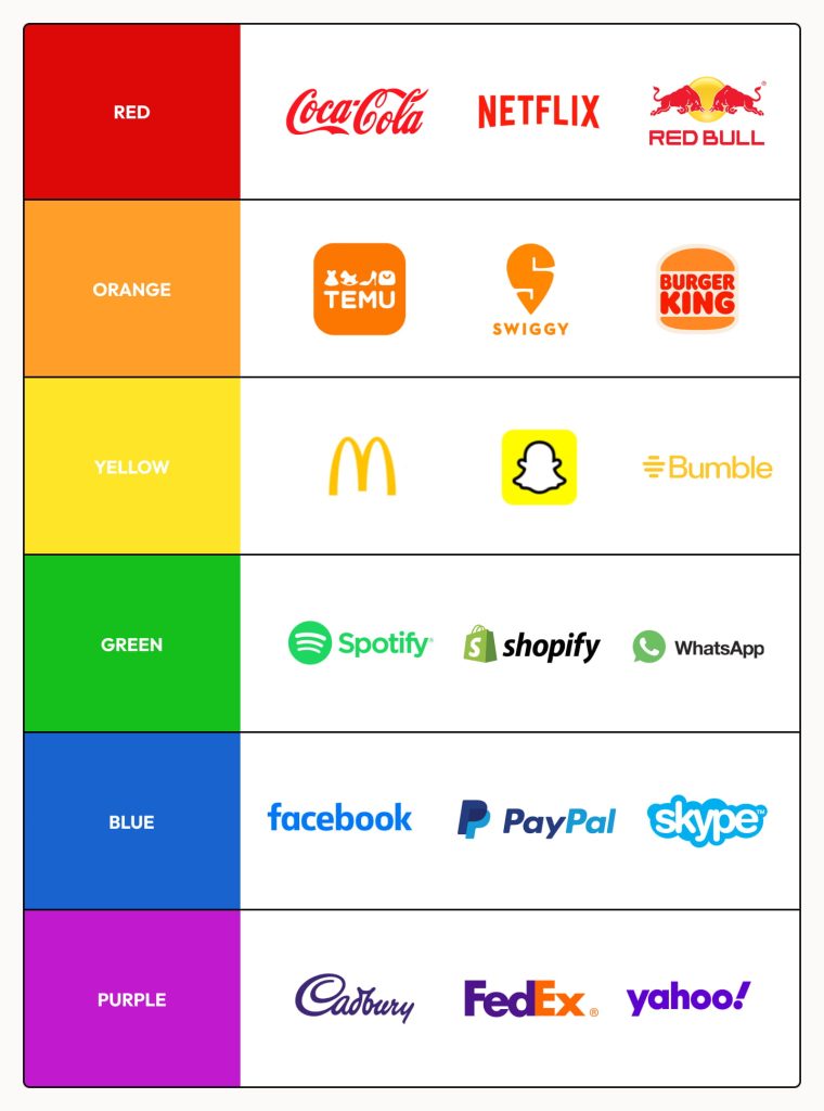
- Coca-Cola — Turns red into excitement, sociability, and instant recognition.
- Target — Uses red to inject energy into its “deal” perception and increase impulse buying.
🔵 Blue – Trust, stability & safety
What it represents: Blue signals security, reliability, and calm. It reduces anxiety and makes people feel safe — perfect for industries where hesitation kills conversions.
How brands can use it: Use blue in onboarding flows, email headers, SaaS dashboards, and pricing pages where trust is everything. Works brilliantly for “Start Free Trial” or “Sign Up Securely” CTAs.
Brands using blue effectively:
- PayPal — Blue reinforces financial safety during payments.
- Shopify — Uses muted blues for calm, trustworthy merchant onboarding and support pages.
Related reading: 10 Best Discount Email Templates + Examples
🟡 Yellow – Attention, optimism & quick focus
What it represents: Yellow grabs attention instantly — the human eye notices it faster than most colors. It radiates optimism, creativity, and warmth. Too much, though, triggers tension.
How brands can use it: Use yellow in highlights, sale tags, announcement bars, and product features you want shoppers to notice without overwhelming them. Great for welcome emails, pop-ups, or free-shipping banners.
Brands using yellow effectively:
- IKEA — Bold yellow signals affordability and approachable design.
- McDonald’s — Uses yellow arches for instant visibility and cheerful branding.
🟢 Green – Growth, balance & “good choice” psychology
What it represents: Green evokes nature, wellness, balance, and financial growth. It feels reassuring and positive — the emotional opposite of red.
How brands can use it: Use green for eco-friendly messaging, sustainability badges, “Save Now” CTAs, positive prompts in checkout (“You’re eligible for free shipping!”), and product imagery related to health or wellness.
Brands using green effectively:
- Whole Foods — Built an entire identity around green = natural, clean, trustworthy.
- Spotify — Green represents energetic growth and creativity while staying friendly.
🟣 Purple – Luxury, creativity & premium value
What it represents: Purple has royalty in its roots — exclusivity, luxury, creativity, and high-status appeal. It feels sophisticated and slightly mysterious.
How brands can use it: Use purple for premium memberships, beauty products, high-tier pricing, and email banners promoting elevated or exclusive experiences. Works perfectly for subscription upgrades and VIP programs.
Brands using purple effectively:
- Cadbury — Royal purple signals indulgence and premium chocolate.
- Twitch — Uses purple to blend creativity, imagination, and digital culture.
⚫ Black – Power, authority & premium minimalism
What it represents: Black expresses boldness, luxury, exclusivity, and absolute confidence. It strips distractions and forces attention onto the product.
How brands can use it: Use black for luxury eCommerce themes, high-end product pages, minimalist email templates, premium subscription tiers, and contrast-heavy CTAs for an elite feel.
Brands using black effectively:
- Apple — Black spaces and product shots signal precision and premium value.
- Chanel — Black embodies timeless luxury, elegance, and sophistication
Use the right colors to boost clicks and recover more sales with Retainful’s email templates.
Strategic color mapping in e-commerce stores: Turning browsers into buyers
A high-converting store isn’t designed at random — it’s mapped, engineered, and color-coded on purpose. Great UX teams don’t “pick pretty colors.” They choose shades that push shoppers through a friction-free journey from landing page to checkout.
Your header, hero banner, buttons, badges, and backgrounds each play a role. The hero needs contrast to pull the eye. The CTA needs dominance so it doesn’t get lost. The offer badge needs urgency so people move fast. And your checkout background must stay clean, calm, and distraction-free — it’s where conversions happen, so it can’t compete for attention.
Call this color choreography.
Every hue has a job:
- Primary brand color — identity and recognition
- Secondary color — emotional contrast
- Accent color — CTA and conversion power
- Neutral tones — reduce tension and add clarity
- Success/confirmation color — reassure buyers
- Error/alert color — redirect without panic
- Highlight color — emphasize urgency or exclusivity
When these are mapped correctly, the shopper glides through your site without resistance. Their eyes land exactly where you want them. Their brain interprets signals instantly. And their mouse moves toward the checkout button almost automatically.
This is how color becomes the quiet operator behind high sales numbers — not loud, not obvious, but strategically powerful.
Building a color-driven brand identity that converts across all touchpoints
A brand isn’t just a logo — it’s a feeling people recognize before they even read your name. And color is the heartbeat of that feeling. The strongest brands in the world don’t use random palettes; they use consistent, strategic color identities across every touchpoint: website, product packaging, emails, ads, and social content.
Consistency builds trust. Trust builds purchases. Purchases build loyalty.
A color-driven brand identity starts with choosing a palette that matches your mission. A wellness brand leans on greens and earth tones. A tech brand relies on cool blues and clean neutrals. A luxury brand uses deep blacks, metallics, and rich tones. Once chosen, this palette becomes your language — your emotional shorthand across every channel.
In eCommerce, this means product pages that feel like “you,” not a template. It means emails with CTA buttons that look familiar, comfortable, and unmistakably yours. It means ads that people recognize instantly — even when your logo is hidden.
Color becomes a powerful brand memory cue—shaping trust, boosting recognition, and influencing repeat purchases. When used consistently, it helps people remember your brand faster, connect emotionally, and choose you again over competitors.
When your colors stay consistent, they don’t just decorate your brand — they define it, reinforce it, and convert for it 24/7.
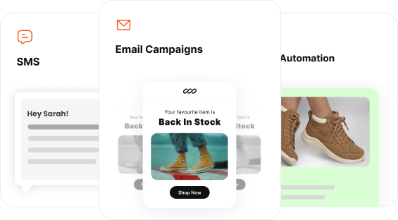
Customize your restock alerts effortlessly using Retainful’s ready-to-use templates to land more sales.
Wrap up
Color isn’t just decoration — it’s the emotional engine driving how shoppers think, feel, and buy. When brands understand how shades spark trust, urgency, or desire, every page view becomes a chance to influence action long before the copy speaks.
Mastering color psychology turns your store into a silent, high-converting salesperson working 24/7. And when you pair smart design with automated retention tools like Retainful, you turn those first impressions into long-lasting customer loyalty.
Also read:
- 30 Best email marketing examples that drive sales in 2025
- How to customize WooCommerce email? (default settings, code & plugins)
- 70+ Win-back Email Subject Lines for Boosted Open Rates
Frequently Asked Questions:
Color psychology studies how different colors influence emotions, behavior, and purchase decisions. Marketers use it to guide attention, build trust, and increase conversions.
Yes. Research shows that up to 90% of first impressions come from color alone, and strategic color use can significantly improve clicks, engagement, and sales.
It depends on your goal: red for urgency, blue for trust, green for positive action, yellow for attention, and black for luxury. Your brand’s tone should guide your palette.
CTA button colors, header backgrounds, and product images all influence click-through rates. For example, red boosts urgency, while blue increases trust and readability.
Start with your brand personality, audience psychology, and industry expectations. Test variations, track conversions, and refine. Data—not guesswork—should decide your color palette.