
☕ Good Tuesday Morning!
We’re not going to waste any time putting your brain to work.
Welcome to another edition of Acquire and Retain by Retainful. I’m Sanjai Kathirvel, and yesterday an email made me almost buy something I didn’t need.
The subject line? “Take a second look!”
The sender? Alo Yoga.
What happened next? I clicked. I browsed. I added to cart…
…and then I closed the tab.
Why? That’s exactly what we’re breaking down today. This email did some things brilliantly and made one mistake that cost them my sale.
What you’ll learn: How to steal their best tactics and avoid their costly error.
Ready?
📧 The Email That Stopped Me in My Tracks
From: Alo Yoga
Subject: Take a second look!
Email Type: Browse abandonment / Product reminder
My Action: Clicked through (but didn’t buy… we’ll get to why)
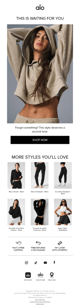
Here’s the exact email (see image breakdown below):
🔍 The Deep Dive: What Alo Did RIGHT
1. The Subject Line Psychology
“Take a second look!”
Why it works:
- Curiosity gap: What am I supposed to look at again?
- Soft command: Not pushy, but directive
- Implies I missed something: Creates mild FOMO
- Short and scannable: 4 words, perfect for mobile
The psychology: Our brains hate incomplete tasks. When someone says “take a second look,” your brain wants to know what you missed the first time.
2. The Header Hook
“THIS IS WAITING FOR YOU”
Genius move: This isn’t about the product—it’s about ME. They made it personal without using my name.
Why it works:
- Ownership language: “Waiting for YOU” implies it’s already mine
- Creates urgency: Something is waiting (time sensitivity)
- All caps: Grabs attention without being salesy
3. The Visual Story
That hero image isn’t just a product shot—it’s a lifestyle moment.
What they nailed:
- Aspirational lifestyle: Not just clothing, but a mood
- Perfect lighting: Soft, dreamy, Instagram-worthy
- Body language: Relaxed, confident, approachable
- Product in action: Shows how it fits and moves
The psychology: People don’t buy products—they buy better versions of themselves.
4. The Gentle Nudge
“Forget something? This style deserves a second look.”
Breakdown:
- Question hook: “Forget something?” (makes you think)
- Flattery: “This style deserves…” (validates your taste)
- Soft pressure: Not “BUY NOW” but “second look”
Why it works: Feels like a helpful friend, not a pushy salesperson.
5. The Trust Builders
Those three icons at the bottom? Pure conversion magic:
- Fast & Free Shipping: Removes cost barrier
- Free Returns: Removes risk barrier
- Pay Later: Removes budget barrier
The psychology: Every barrier you remove increases purchase likelihood exponentially.
Eurus is a premium, high-performance Shopify theme designed for speed, flexibility, and conversions -perfect for merchants who want a fast, modern, and easy-to-use store.
🎯 The Clever Cross-Sell Strategy
“MORE STYLES YOU’LL LOVE”
This section is brilliant for three reasons:
1. The Curated Selection
- All similar aesthetic (black/neutral colors)
- Same price range (no sticker shock)
- Different product types (variety without overwhelm)
2. The Layout Psychology
- Grid format: Easy to scan and compare
- Equal sizing: No hierarchy = no pressure
- Product names: Build familiarity with brand language
3. The Subtle Scarcity
By showing “more styles,” they’re implying limited selection—making the original product feel more special.
🚨 What Alo Got WRONG (And Cost Them My Sale)
1. Zero Personalization
The miss: Generic email to everyone who browsed The fix: “Hi [Name], remember checking out this hoodie yesterday?”
2. No Social Proof
The miss: No reviews, ratings, or “others also bought” The fix: “Sarah from LA says: ‘Obsessed with how soft this is!'”
3. Missing Urgency
The miss: No time pressure or inventory alerts The fix: “Only 3 left in your size” or “24-hour flash sale”
4. Weak Call-to-Action
The miss: Generic “SHOP NOW” button The fix: “Get My Hoodie” or “Yes, I Want This”
5. No Exit Strategy
The miss: One CTA, take it or leave it The fix: “Not ready? Save it for later” (wishlist CTA)
💡 The Hidden Gem: What Most People Missed
The footer strategy is GENIUS:
Look at those social media icons—they’re not just links. They’re brand ecosystem builders:
- Instagram: Lifestyle content and UGC
- TikTok: Viral trends and challenges
- YouTube: Workout videos and tutorials
- Facebook: Community building
The strategy: If you won’t buy today, we’ll keep you in our world until you’re ready.
🎯 7 Techniques You Can Steal Today
1. The “Waiting for You” Framework
Replace “Check out our products” with “This is waiting for you”
2. The Lifestyle Hero Shot
Show your product being lived with, not just worn/used
3. The Gentle Question Hook
Start with “Forget something?” not “Complete your purchase”
4. The Three-Barrier Breakdown
Always address: Cost, Risk, and Timing concerns
5. The Curated Cross-Sell
Show 6 similar items, not 20 random ones
6. The Ecosystem Footer
Your social links should tell a story, not just exist
7. The Soft Command Subject
“Take a second look” beats “Don’t miss out” every time
📊 The Data Behind the Magic
Browse abandonment emails like this typically see:
- 25-35% open rates (vs 20% for regular campaigns)
- 3-8% click rates (vs 2-3% average)
- 1-3% conversion rates (vs 0.5-1% average)
Why Alo’s approach works:
- Soft sell approach: Reduces unsubscribe rates
- Lifestyle focus: Increases brand affinity
- Multiple CTAs: Captures different buyer types
🔧 How to Apply This to YOUR Store
For Fashion Brands:
- Use lifestyle imagery over product shots
- Focus on how the item makes customers feel
- Include size/fit guides prominently
For Home Goods:
- Show products in styled rooms
- Emphasize comfort and functionality
- Include care instructions upfront
For Tech Products:
- Focus on problem-solving benefits
- Include compatibility information
- Show real-world usage scenarios
- Make it about the customer, not the product
- Remove purchase barriers systematically
- Create an ecosystem, not just a transaction
And that’s a wrap for this edition!
Thanks for diving deep with me today—hope you snagged some good stuff to test in your own emails!
If this breakdown sparked even one “aha!” moment, do me a solid and share it with that one marketer friend who always asks “how’d they do that?” Let’s get them reading so they don’t miss when we dissect that $2.3M cart recovery sequence next week.
Remember: Your customers aren’t just buying products—they’re buying better versions of themselves.
Sanjai Kathirvel
Your email-obsessed friend from Retainful 🚀
P.S. – Hit reply and tell me the worst browse abandonment email you’ve ever received. I might roast it in next week’s edition (anonymously, of course).