A call to action button converts a visitor into a customer. Most businesses focus on website design, user interface, attractive visuals, etc., leaving out call-to-action, resulting in poor conversion rates.
Think of call to action buttons as a signpost showing customers what to do. Without it, they might find it hard to navigate your website leading to a poor experience.
The best practice is to create a great call to action by referring to some of the best call to action examples to see how successful businesses are doing it. If you’re wondering why your store’s traffic is not reflected in your sales, then your store lacks a compelling call to action button to convert visitors.
In this blog learn:
- How to write the best call to action
- CTA button ideas
- Call to action best practices
- Call to action sentence examples
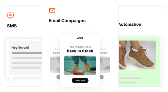
Join Retainful now and unlock the full potential of referral marketing to propel your business to new heights.
What is a Call to Action?
A call to action (CTA) is a prompt or button that encourages users to take a specific action, like “Buy Now”, “Sign Up”, or “Learn More”. CTA is used in websites, emails, and ads, CTAs drive engagement and conversions by guiding users toward desired actions.
A call to action must guide your visitors and not force them to do it.
For example, if your store has new arrivals, you can create a homepage banner with a CTA ‘Check it out – this gives your visitors the option of viewing the products before buying, whereas using ‘Buy Now will feel too pushy.
Types of Call To Action
Types of call to action are:
- Lead Generation Call to Action
- Sales-driven ecommerce call to action
- Engagement creating call to actions
- Form Submission call to actions
- Social proof call to action
- Event & Webinar call to action
- Free trial & demo SaaS call to actions
1. Lead Generation Call to Action
Used on: Landing pages, popups, blogs
Purpose: Collect emails or sign-ups
Lead generation call to action examples:
- Download Your Free Guide
- Sign Up for Our Newsletter
- Claim Your Free Trial
Call to action verbs to use for lead generation :
- Sign Up – “Sign Up for Early Access!”
- Join – “Join 50,000+ Happy Customers!”
- Subscribe – “Subscribe for Exclusive Deals!”
- Start – “Start Your Free Trial Today!”
2. Sales-driven ecommerce call to action
Used on: Product pages, checkout pages, ads
Purpose: Convert visitors into paying customers
Sales-driven ecommerce call to action examples:
- “Buy Now & Get 10% Off!”
- “Limited Stock – Order Today!”
- “Claim Your Discount”
Call to action verbs to use for driving sales:
- Buy – “Buy Now & Save 10%!”
- Get – “Get Yours Before It’s Gone!”
- Claim – “Claim Your Discount Now!”
- Grab – “Grab Your Deal Before It Expires!”
3. Engagement creating call to actions
Used on: Blogs, social media, videos
Purpose: Encourage interaction & shares
Engagement creating call to action examples:
- “Leave a Comment Below!”
- “Share This Post with Friends!”
- “Like & Subscribe for More Content!”
Call to action verbs for creating engagement:
- Comment – “Comment Below & Share Your Thoughts!”
- Follow – “Follow Us for More Updates!”
- Explore – “Explore Our Latest Collection!”
- Discover – “Discover Your Perfect Fit!”
4. Form Submission call to actions
Used on: Contact forms, sign-up pages
Purpose: Get users to fill out forms
Form submission call to action examples:
- “Get a Free Quote Now!”
- “Schedule a Call with Us!”
- “Sign Up for Early Access!”
Call to action words list to be used for form submission:
- Submit – “Submit Your Application Today”
- Request – “Request a Free Quote”
- Apply – “Apply Now for Early Access”
- Download – “Download Your Free Guide”
5. Social proof call to action
Used on: Product pages, checkout pages, testimonials
Purpose: Encourage trust & validate decisions
Social proof call to action examples:
- “See Why 10,000+ Customers Love Us!”
- “Read Customer Reviews Before You Buy!”
- “Join 50,000+ Happy Subscribers!”
6. Event & Webinar call to actions
Used on: Websites, emails, social media
Purpose: Encourage sign-ups for events
Event and webinar call to action examples:
- “Reserve Your Spot Now!”
- “Register for Our Free Webinar!”
- “Join the Live Workshop Today!”
Call to action words list to use for event/webinar registration:
- Register – “Register Now for Free”
- Reserve – “Reserve Your Spot Today”
- Save – “Save Your Seat Before It’s Full”
- Join – “Join Our Live Webinar”
7. Free trial & demo SaaS call to actions
Used on: SaaS websites, product pages, ads
Purpose: Let users try before they buy
SaaS website call to action examples:
- “Start Your Free Trial Today!”
- “Try for Free – No Credit Card Required!”
- “See It in Action – Request a Demo!”
9 Great Call To Action Examples
Thousands of eCommerce stores use CTAs, but we’ve listed some of the best call-to-action examples from iconic brands worldwide.
1. Sony – Call to action for conversions
Sony, even the iconic brand, emphasizes CTA to increase its conversions.

CTA Location – Homepage
CTA Button – Step Closer to Reality
Why does this example of CTA button work?
This CTA button for conversion is placed above the fold, i.e., on the homepage banner. That’s the first thing a visitor would see when he enters the website. Attractive images and words like ‘8K brilliance’ is used to grab the reader’s attention.
But the most incredible thing is the words used in this eCommerce call to action button. It says ‘Step closer to Reality,’ increasing curiosity and urging the visitor to click on it.
And finally, what happens when you click it? It redirects you to the purchase page with a bright orange CTA that says ‘BUY.’
This call to action example is an excellent tactic to convert visitors into customers in two-simple steps.
2. Chewy – Sales driven call to action
Yes, even pet stores understand the advantages of a strategically placed CTA.
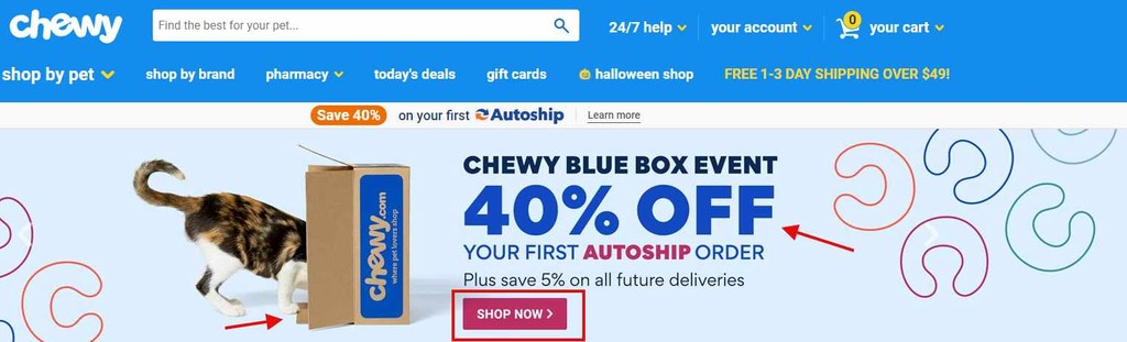
CTA Location – Homepage
CTA Button – Shop Now
Why does this example of call to action work?
The main reason is the location of the CTA button and what it represents. It is an attractive CTA right on the homepage, which the visitors see first.
The second reason is the offer, which closely resembles the ‘Value-based CTA’ we mentioned earlier. The visitor will be tempted to click the CTA as they can earn a 40% discount.
It is called a ‘Chewy blue box event,’ and a dog is checking out a blue box – notice how they haven’t revealed what’s in the box. It is a surprise gift from Chewy, this increases the visitor’s curiosity, and they’ll end up clicking the button.
Offering discounts like these using eCommerce call-to-action buttons will help you minimize cart abandonment.
PlayStation – Call to action for creating lead generation
The PlayStation homepage is loaded with CTAs, probably the best use of CTA we’ve seen. The homepage alone gives three opportunities to get the visitors converted.
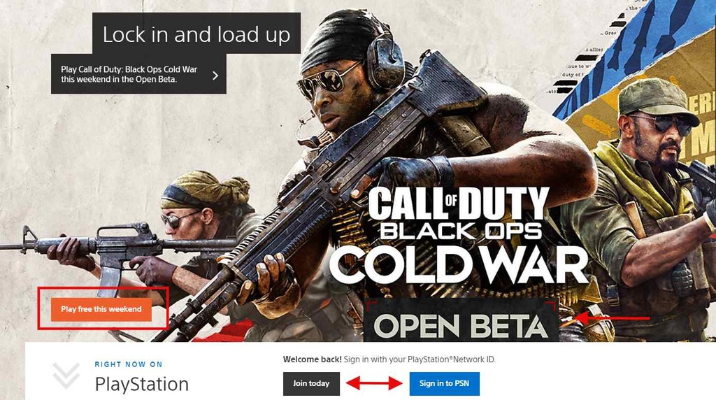
CTA Location – Homepage
CTA Button – Play free this weekend. Join us, Sign in to PSN, Open Beta
Why does it work?
Games are the talking point here, so as soon as you enter the site, the banner displays the image with this sample call to action that says, ‘Play free this weekend.
Such a bright CTA – when you click it, it immediately takes you to the purchase page. Customers will proceed to purchase as it is free for the weekend and adds value to the customer. The ‘Open Beta’ CTA also takes the user to the purchase page.
But the most important thing about the homepage banner is the ‘Join Today’ and ‘Sign in to PSN’ CTAs.
This good CTA are not there to sell the products but to persuade visitors to join the PlayStation community. That’s a clever way to build a community around the brand and increase the customer base.
Lulu’s Fashion – Call to action for creating engagement
We’ve seen enough call to action copy examples from homepages; let’s look at other pages like this Referral section from Lulu’s Fashion website.

CTA Location – Referral Page
CTA Button – Start Sharing The Love
Why does it work?
Lulu’s Fashion is a store that is designed specifically for Women. Instead of a simple eCommerce call to action button, they went with an emotional one that engages well with the audience, ‘Start Sharing the love.
The good CTA stands out in the section. Lulu has clearly explained their referral program and the emotionally-triggering call to action will push a customer to click it.
Start using Retainful for free and create email campaigns with highly interactive call-to-action buttons and templates.
Rakuten – Call to action for downloading an app
One of the fastest-growing eCommerce retailers originally from japan fastest-growing eCommerce retailers that offer exclusive cashback has used their call to action button for a different yet compelling cause.
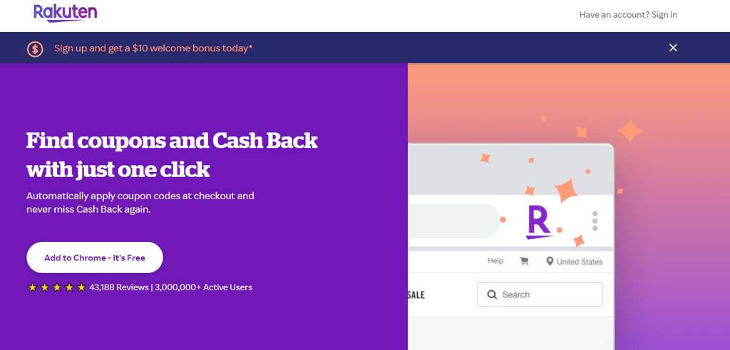
CTA Location – Home Page
CTA Button – Add to Chrome – It’s Free
Why does it work?
Customers always look for offers, discounts, or Cashbacks while shopping at their favorite eCommerce stores. Now with Rakuten, they can find coupons and earn cashback easily.
That said, Rakuten’s main goal is to make people use their service while shopping at any eCommerce store.
So, what they did is they made it readily available to customers by offering an extension, and customers can install it with just a single click.
Now customers can use Rakuten’s cashback service with just one click, which is pretty simple and effective.
Customers expect an answer when they click the CTA – additional navigation will only frustrate them. So, your CTA redirect must immediately take them to the conversion page.
Versace – Call to action for signing up for newsletter
Versace was a surprise to us, and we wondered how a designer brand that creates eye-catching fashion apparel has a simple eCommerce call to action button.
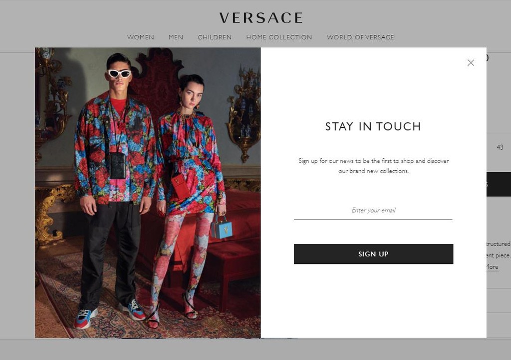
CTA Location – Home Page Popup
CTA Button – Sign Up
Why does it work?
Unlike others, this CTA is located in a popup, displayed as soon as you enter the Versace homepage.
A simple CTA that serves a special purpose. They request visitors to stay in touch with the brand to receive exciting news about the store and their new collection through their newsletters.
It grabs the visitor’s email address as soon as they enter and has a straightforward ‘Sign Up’ CTA with no fancy words.
With this CTA, they’ve successfully converted a visitor into a subscriber. They can initiate email marketing, send newsletters and bring customers back to their store to purchase.
Calvin Klein – Call to action for exploring products in ecommerce
Calvin Klein has designed their CTA in the simplest way possible. No fancy, thought-provoking words or attractive colors.
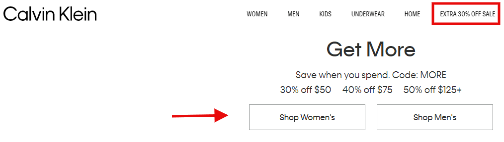
CTA Location – Home Page
CTA Button – Extra 30% off sale, Shop Women, Shop Men
Why does it work?
The main goal of using a call to action is to convert visitors. And what better way is there to do it than showcasing your offers on the homepage?
Notice how they didn’t use attractive images to show off their discounts, just simple Black & White CTAs like their Logo.
It is a brilliant tactic to display the ‘Extra 30% off sale’ CTA on the homepage. The visitor will be tempted to click it and get redirected only to the products that are offered at 30% off.
The other eCommerce call-to-action buttons, ‘Shop Women’ & ‘Shop Men,’ are placed right below the discount criteria. If you purchase above $125, you get a 50% off.
The visitor will know how much he has to purchase to receive the discount, which adds value to the visitor and pushes them to check it out.
Lifestraw – Call to action for exploring more content
This is probably the only educational call to action copy example on this list. Lifestraw starts by selling a compelling story.
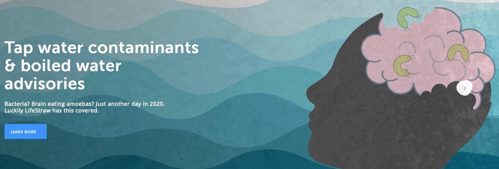
CTA Location – Home Page
CTA Button – Learn More
Why does it work?
Lifestraw gets the attention of the visitor right away with a warning ‘Tap water contaminants & Boil water advisories.
And then, they go on to talk about brain-eating amoebas with images that look like a brain and amoebas. This makes the visitor curious about what they are trying to convey here.
As the visitor is puzzled, they finish the sentence with ‘Lifestraw has got you covered.
This will tempt the visitor and make them click the call to action ‘learn more to learn more about their product, and it takes them to an educational article.
Even though this CTA copy example doesn’t make the visitor purchase, it educates them about the product. You can use the same tactic in your stores too. Educate your visitors about your product – it will boost their confidence and convert them into customers.
Nike – Call to action for exploring the product
Nike has one of the best conversion CTA of any eCommerce store dedicated to shoes.
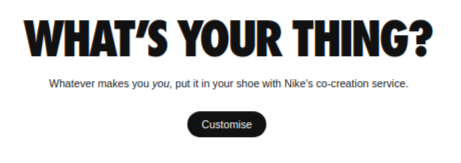
CTA Location – Landing page
CTA Button – Customise
Why does it work?
This is one of the few brands that allows visitors to customize their shoes, and Nike was the first to do it. It has a simple call to action, ‘Customise.’
It works well because the store will not have a product that matches the visitor’s style every time. So, by using customization, the visitor can alter the product as he wishes.
Reports say that Nike had a rapid boost in their conversion rate when they made this eCommerce call-to-action option available. If your store offers something unique – showcase them with a compelling CTA to increase your conversions.
How to write a call to action?
There are no definitive principles for writing a call to action for eCommerce stores. But some practices have worked great for many eCommerce stores. According to Sweor, 70% of small business websites don’t have CTA. If you are one of those businesses, follow these practices to create a call to action that converts customers readily.
Create Urgency
The ultimate goal of an eCommerce call to action button is to urge customers to take action. You can easily do that by adding a psychological trigger to your CTA.
Pushing a customer to take action will be easy if you create a sense of urgency using CTAs like – Buy now, Limited offer, Only x products left, and so on.
Using FOMO in CTA is a proven practice that almost every popular eCommerce company uses. A recent study by RevenueHero showed that creating urgency using CTAs increased the conversion rate by 332%.
So, take a look at your CTAs, add urgency, and watch the conversion happen.
Using Action words
A call to action should motivate the visitor to engage with the website, and an effective way to do it is by using actionable words.
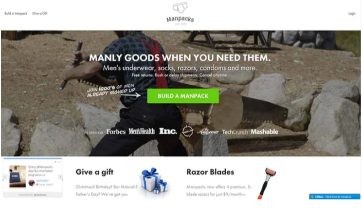
This eCommerce call to action button by Manpacks ‘Build a Manpack’ is the best example of an actionable call to action. It tells the visitor exactly what to do, and they’ve used social proof for further encouragement.
Call to action like these will grab visitors’ attention and increase their curiosity to check it out.
Boost sales with Retainful’s Abandoned Cart Emails and CTA buttons, guiding customers directly to their Checkout page without distractions.
Leverage the value
Instead of using an action-based call to action, you can use a value-based CTA to convert customers. A CTA like’ Buy Now’ will not convince customers if you’re running a special season deal. You must show the value that a customer can earn, so use a CTA like ‘Buy now and earn 30%’ to convince customers.
Design your own CTA
Personalization is the most important aspect of creating a successful call to action for an eCommerce store. Because only you know the type of users your website will attract, so design your CTA relevant to your visitors.
Here are a few tips on how to design the best CTA,
- Your CTA must be vibrant and attractive.
- Use only 3 to 4 words. It should not be too long.
- Make good use of White spaces to make the CTA stand out.
- Optimize your CTA for all devices.
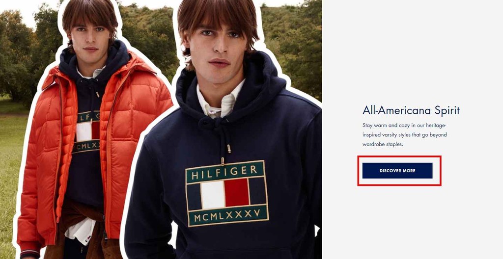
This is how Tommy Hilfiger does it – the color of the CTA matches the brand, and they’ve effectively used white space around the CTA to add more attention to the CTA. According to Sixth City Marketing’s study, adding arrow icons at the end of buttons led to a 26% increase.
Color of the CTA
Color differentiates the CTA from the rest of the page, making the button stand out.
But you must use the color well and be relevant to customers and your brand. CTA color should be vibrant, attractive, and different from the color of your webpage.
Using bright colors is one of the CTA copy best practices, and it must instantly grab the visitor’s attention.

Here are some quick tips,
- Use white spaces to make the color pop out.
- Don’t use too much contrast and animation.
- Make sure it is different from the background.
Optimize for multiple devices
One common mistake of eCommerce stores is that most businesses do not optimize their CTAs for multiple devices. More than two-thirds (67.2%) of online sales come from mobile commerce. So, ensure your CTA can fit different devices, or you’ll lose valuable conversion.
Keep it above the fold.
A Fold is the section of your website that visitors see before scrolling down. Display a banner with a compelling CTA above the Fold to grab your visitor’s attention right away and allow them to engage with your store right after they enter.
Eliminate decision fatigue by including a clear call to action in your emails. Use our pre-built email workflows to set up converting CTAs in your abandoned cart recovery campaigns.
Conclusion
No matter how good your store’s design or user-friendly interface feels, you’ll have difficulty converting customers if you don’t have a CTA.
CTA makes it easy to navigate and guides visitors to take action. But you need to place them strategically. Follow our tip and place a CTA in your homepage’s ‘Above fold’ area to grab attention.
Writing actionable and value-based CTA Is crucial. That’s why we listed some of the best call-to-action examples that can urge customers to take action.
All the Call-to-action examples we discussed will show you how to use it and where to place the CTA to get the maximum conversion.
The best practice is to use attractive colors and enough white space around it to make the call to action button stand out.
Frequently Asked Questions
A call to action ( CTA) is a text that motivates the target audience to execute the desired action. “Buy Now” or “Download Now” are simple calls to action. Avoid lengthier CTAs like “Subscribe today, so you never miss an article.”
CTAs depend on your campaign. But generally, Begin your CTA with a powerful command verb. Use phrases that create passion or excitement, and give cause to take the necessary action and Take advantage of FOMO.
In ecommerce, a call to action CTA button should make it clear to visitors what the next step in their journey will be. This could be to add an item to their online shopping cart, subscribe to a service, or finish a purchase. With clear CTAs, visitors can follow the route to Pages.
“Buy Now” or “Download Now” commonly use simple calls to action. The friendly, creative, and demanding phrases like this encourage visitors to take the desired action.
A good call to action phrase is concise, compelling, and prompts immediate action. It should clearly communicate the desired outcome and create a sense of urgency.