As an eCommerce store owner, you know that reducing the checkout time in your shopping cart can make a huge impact on your sales.
Customers don’t want to spend a lot of time filling out forms and entering their payment details, and a lengthy checkout process can lead to shopping cart abandonment. But how can you streamline the checkout process and make it as quick and easy as possible for your customers?
In this blog post, we’ll explore some simple and effective strategies to reduce checkout time in your shopping cart. By implementing these tips, you’ll be able to optimize your eCommerce store and improve the overall shopping experience for your customers, leading to increased conversions and more sales. So, let’s get started and learn how to reduce checkout time in your shopping cart!
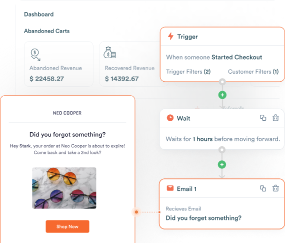
Ready to streamline your checkout process and reduce cart abandonment? Try Retainful today and see how it can help improve your sales!
8 Design Strategies for a Faster Shopping Cart Checkout
Learn 8 ways to reduce checkout time in a shopping cart by bringing about changes to the design. The irony is that these methods also double up as abandoned cart solutions.
The basis of all of these strategies is just one attribute – being minimal. Declutter your design page and only present what the customer expects.
Eager to know more?
Dive in!
Field optimization
Checkout pages without fields are rare to find. So, fields must be optimized in the first place to reduce checkout time in a shopping cart. This eventually leads to a better Shopify checkout page design.
Field optimization can be done in 5 ways.
Cut down the number of fields
Research by Baymard revealed that the number of fields for an average checkout is 14 whereas the actual requirement is only half of it, around 6 to 8.
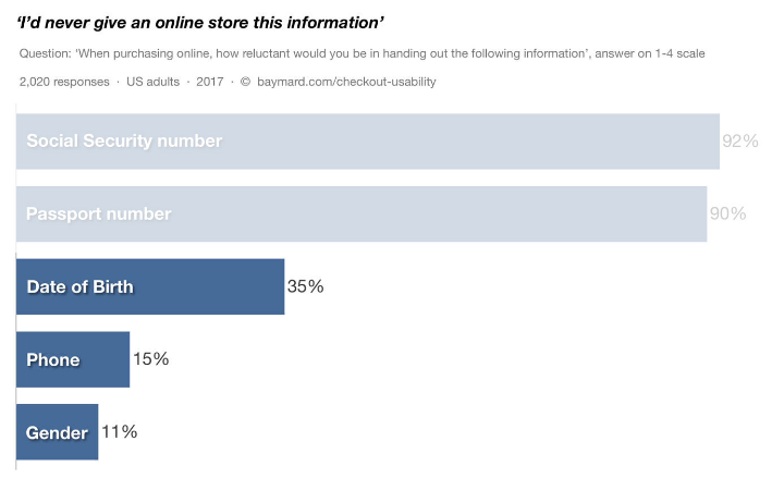
It is obvious that there are a number of unnecessary fields. Another survey by Baymard brought to light the information that eCommerce customers would refrain from disclosing.
Remove Mailchimp region text box from settings to reduce cart abandonment and checkout time.
Mark both mandatory and optional fields
Yes, you read that right. Mark both mandatory and optional fields. You are inviting the customer to fall into a state of dilemma when marking either only required fields or only optional fields.
Make it clear and put it out there which are the fields that are optional and which ones are mandatory. In a checkout usability testing done by Baymard, the form completion rates were higher when both the fields were clearly marked.
Baymard suggests refraining from
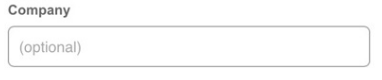
- Marking the field as optional inside the text box.
- Giving a general statement ‘All fields are required.
Form autocomplete
Form autocomplete is one great trick for customers who have not registered with your Shopify eCommerce store. Repetitively filling out address forms when buying products online is so tiresome and boring indeed. Relieve them from this pain and let them breeze through the checkout process.
The good news is that Google Autocomplete is automatically enabled for free for every Shopify page checkout design. Shopify themselves tested this feature and found to have saved time by 20% in the checkout process.
Use Microcopy
Have you found tiny texts in the shipping address forms of checkout pages?
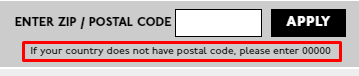
The above image shows a microcopy from the Madewell checkout page. The text assists the customer to enter valid information without making mistakes. This is the purpose of a microcopy. It supports by instructing and saves time as well.
Avoid drop-down menus
Clicking on a drop-down menu is considered an extra step by the customer. It gets even problematic when the menus contain a number of options to choose from.
Baymard suggests using drop-down menus only when there are options more than 3 but less than 10. By this, the need to scroll through the menu can be avoided.
What else to use in place of drop-down menus?
Plain text fields and radio buttons.
This usually applies to fields such as state, shipping method selection, and credit card type.
Streamline the checkout
‘Streamline’ is the right word to be used here instead of ‘one-page checkout’. You can simply imagine the amount of information that needs to be crammed into a page if it is a single-page checkout. That would look hideous, long, and unappealing.
Alternatively, it is a better option to have multiple tabs with less interference and just a handful of information to be keyed in.
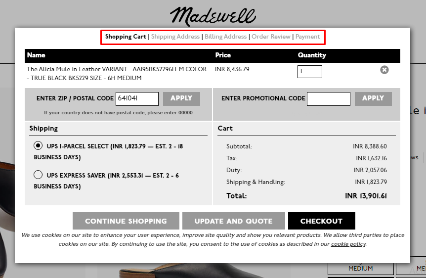
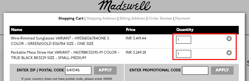
For example, let’s consider the checkout page from the Madewell website. It is divided into 5 tabs – Shopping Cart, Shipping Address, Billing Address, Order review, Payment.
The information to be entered in the pages is the following.
- Shipping Cart – Zip Code, Promotional Code. Shipping means is selected by default.
- Shipping Address – There are many fields but autocomplete is activated. Just one letter and that is settled.
- Billing Address – The same address as shipping is present by default.
- Order Review – Review and enter the card details to make the payment.
The work to be done by the customer is very minimal and so the checkout happens in a jiffy. Try it out yourself.
When the checkout is streamlined, there is no need to spend time on recovering abandoned checkouts with cart recovery emails and retargeting.
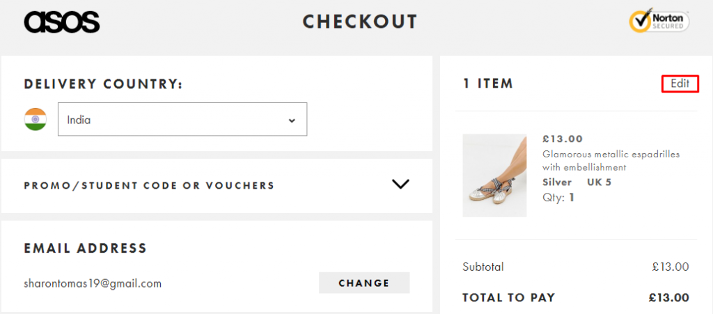
Offer guest checkout option
37% of people attributed to ‘the site wanted me to create an account as a reason for increasing cart abandonment rate, according to a survey by Baymard Institute. It clearly reveals that the site visitors had no option to checkout as a guest and registration made mandatory.
Mandatory registration consumes a significant amount of time. Even if it is 10s, it is of much value from the customers’ point of view. By eliminating this, two milestones are achieved – happy customer and less checkout time.
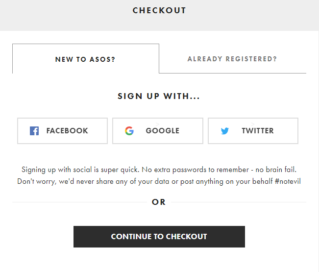
Look at the screenshot below from ASOS. The online store has done it in a clever manner. This window pops up during the checkout process with two tabs – ‘New To Asos?’ and ‘Already Registered?’.
New members have to option to sign up using social media profiles which makes it faster rather than having to create a new profile from scratch. They are also given the chance to proceed to checkout if uninterested to sign up.
Point out validation errors with messages
It literally irks customers if errors are pointed out when the checkout is just a click away. It gives a sense of feeling that they have to do it all over again.
So, make it a point to send out error messages, if any, then and there when the shipping address or any other form is being filled. This saves ample amount of time for the customers.
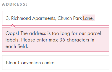
The shipping address form of ASOS showed an error message when the number of characters exceeded the field limit. This makes the customer take action immediately in order to make use of the next address field.
The possibilities of an abandoned cart can be reduced when the customers are told how to fix the errors in the messages.
In a nutshell, do two things.
- Point out the error.
In the above example, the error is ‘the address is too long for our parcel’.
- Give a solution
‘Enter max 35 characters’ is the solution and the website also highlights the characters to be deleted which helps customers take a quick decision.
Don’t let a lengthy checkout process hurt your eCommerce sales! Install Retainful now and start reducing checkout time in your shopping cart.
Optimize mobile checkout
Mobile eCommerce is on the rise. More people prefer to purchase online using their mobiles rather than desktops.
On one hand, the survey says, mobile commerce brought in $156 billion in the US alone and is expected to rise to $420 billion by 2022. On the other hand, mobile conversion rates are the lowest at 0.55%. This is a stark contrast. Tapping into this will significantly increase eCommerce revenue,
All eCommerce websites must be mobile optimized without a doubt. Mobile optimization removes distractions that prevent the customer from shopping without hindrance. Page load time in mobile must be given prime importance.
Support easy cart editing
Decisions do change just minutes before hitting the ‘pay’ button. In this case, the items added to the cart must be allowed to be edited easily.
The checkout page of ASOS has the cart edit option.
Clicking on the edit button takes you to another page where editing can be done.
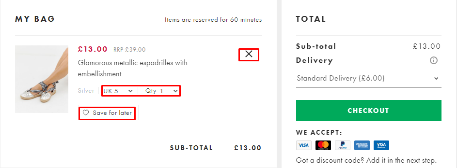
The access is easy here but it is a 2-step process. Cart editing should have been made possible on the checkout page itself.
Madewell does it this way and makes it a 1-step process unless the customer wishes to purchase a completely different product.
In either case, accessibility is what counts. Customers must instantly know where to go in order to edit the items in the cart.
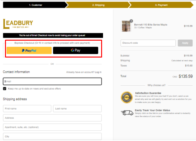
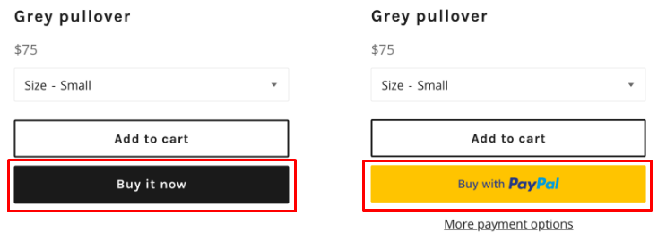
Express payment option
With an express payment option, the customers use payment gateways like PayPal, Google Pay, and Apple Pay to complete the checkout.
Advantage of using payment gateways
- Users need not give the cards and shipping details every time to make the payment. This saves time and increases your-eCommerce-website
- The cart abandonment rate can be reduced just because of the trust people have on the payment gateways for processing information securely.
The image below shows a standard Shopify checkout page with the option to pay using PayPal and Google Pay. This is given as the first option to the customer to make the payment while the alternative needs loads of information to be filled in.
By using express payment, the eCommerce store uses the card and shipping details used in the payment gateway to process the payment and deliver the product.
Use dynamic checkout buttons
Dynamic checkout buttons are a special feature of the Shopify checkout page design. A product can be quickly bought from the product page itself. This means skipping the cart page.
For this, Shopify has dynamic checkout buttons that can be added to all or select product pages or homepage where ‘Add to Cart’ button is present.
Shopify also gives the option to brand the dynamic checkout button with the logos of payment gateways or simply use a phrase like ‘Buy it now’. The only drawback is that this feature is suited only for businesses where people are likely to buy a single product like furniture or mattress.
Looking for an easy way to optimize your checkout process and increase conversions? Retainful has you covered!
Final Thoughts
Make it easier for the customer to finish the checkout process in the shortest time possible. Every minute changes made to the checkout page have an overall impact with reduced average cart abandonment rate and increased customer retention.
A/B test your checkout pages and get to know where you are losing sales and revenue.
Correct the issues and set things right.
Just wait and things will fall in place.
To optimize your shopping cart in WooCommerce, simplify the checkout process, remove unnecessary fields, provide multiple payment options, use clear calls-to-action, and display trust badges and security logos. Additionally, optimize your website speed and ensure your shopping cart is mobile-friendly.
To reduce abandoned checkouts in WooCommerce, you can simplify the checkout process, provide guest checkout options, offer multiple payment methods, and follow up with abandoned cart recovery emails. Additionally, optimizing the website speed, offering free shipping, and providing clear and transparent pricing can also help to reduce abandoned checkouts.
To improve online checkout in WooCommerce, simplify the checkout process by reducing the number of form fields and provide clear instructions, multiple payment options, and a guest checkout option. Also, use security badges and customer reviews to build trust.
To improve cart conversion rate in WooCommerce, you can simplify the checkout process, offer multiple payment options, reduce page load times, provide clear shipping and return policies, and display trust signals such as customer reviews and security badges.
Cart optimization in WooCommerce refers to the process of improving the functionality and design of the shopping cart to increase conversions and reduce cart abandonment rates. This can include optimizing the checkout process, improving the cart design, and implementing abandoned cart recovery strategies.
To optimize the eCommerce checkout page in WooCommerce, you can simplify the checkout process, enable guest checkout, use a single-page checkout, ensure a secure checkout, and offer multiple payment options. Additionally, you can reduce distractions, use clear and concise language, and display trust badges and customer reviews.